
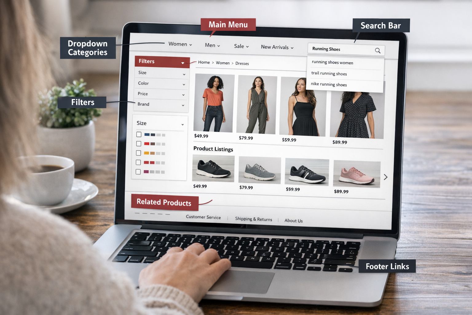
When visitors land on an online store, they need to quickly understand two things: what the store offers and where to find it. The system that enables this is eCommerce navigation.
eCommerce navigation refers to the pathways that help visitors move through a store and reach the pages they need, including the main menu, category and collection pages, filters, site search, breadcrumbs, and links between related products.
According to Athos Commerce, poor product findability can lead to up to 68% of users abandoning a site. When visitors cannot quickly find what they need, many will leave, even if the products or content are strong.
If you want to improve eCommerce navigation to enhance UX, SEO and business growth, then this guide covers practical best practices to help you do it.
Strategic principles for designing effective eCommerce navigation
Designing effective eCommerce navigation goes beyond aesthetics or layout; it fundamentally affects three key areas that determine your store’s success.
First, from the customer perspective, navigation shapes the journey. If users cannot find products quickly, they drop off, reducing conversions and revenue. Second, from a business perspective, navigation reflects strategic priorities. Highlighting the right products and categories ensures campaigns hit KPIs and support overall growth objectives. Third, from a website performance perspective, navigation impacts SEO. Poor structure can limit crawlability, reduce search rankings, and decrease organic traffic.
Because navigation influences user experience, business outcomes, and search performance simultaneously, it is essential to design with all three dimensions in mind. The following three principles focus on these critical factors: Customer journey, Business priorities, and SEO.
-
Design navigation around the customer journey (UX): Navigation should help shoppers move naturally through the store, from discovery to evaluation and purchase. Because users may enter through many different pages, navigation must provide orientation and clear next steps at every stage of the journey.
-
Use navigation to support business priorities: Navigation can guide attention toward revenue-driving categories, strategic product lines, or seasonal campaigns. It should remain flexible enough to highlight high-priority products or promotions while maintaining a stable catalogue structure.
-
Use navigation to signal key pages to search engines (SEO): Navigation creates the internal linking structure that helps search engines understand which pages are most important. Placing strategic pages in navigation and ensuring every page receives internal links helps improve visibility and prevents orphan pages.
Understanding these principles provides the strategic foundation. The sections below outline specific best practices for implementing effective eCommerce navigation in practice.
Expert Insight: Balancing commercial priorities with how customers actually shop
Business priorities do not always match how customers naturally navigate a store. For example, merchants may want to feature promotional collections or specific campaigns, while shoppers typically look for products organised by type, use, or category they already expect.
If navigation prioritises marketing-led categories over these common product structures, shoppers may struggle to find what they need.
Effective navigation balances both. The main structure should reflect how customers search for products, while commercial priorities can be highlighted through secondary navigation, featured sections, or merchandising modules.
|
If you are reviewing your store’s navigation and want expert guidance, On Tap offers a free consultation to evaluate both your information architecture and navigation design and identify practical opportunities for improvement. |
Best practices to improve eCommerce navigation across key site elements
The principles above describe what effective navigation should achieve. In practice, these principles are applied through specific navigation elements across the website, such as the main menu, category navigation, filters, breadcrumbs, search, and internal links.
The best practices below show how merchants can review and improve each of these elements to support three key objectives at the same time: helping customers move through the store more easily, guiding attention toward priority products and campaigns, and strengthening the internal linking structure that supports SEO.
Structure the main navigation to surface your primary product categories
The main navigation (or primary menu) is the top-level menu displayed at the top of the website. It typically contains the store’s main product categories and key sections (collections, new arrivals, or campaigns). Within the navigation system, this menu acts as the primary entry point to the product catalogue, helping visitors quickly understand what the store sells and move into major product areas.
-
Limit the top-level menu to 5-7 primary categories: According to Miller’s Law, the average person can only keep 7 (± 2) items in their working memory. Restricting the menu to this range prevents "choice paralysis," allowing shoppers to scan all available options in a single glance without feeling overwhelmed.
-
Use clear category labels that reflect how customers search for products: Write navigation labels that clearly describe the products within each category. Use specific product-focused terms such as “Mountain Bikes” or “Organic Skincare” instead of broad labels like “Products” or “Shop.” Clear wording helps visitors quickly scan the menu and recognise the correct section without unnecessary exploration.
-
Prioritise frequently used product categories before commercial highlights: Arrange navigation items based on common browsing behaviour. Place the categories customers search for most often at the top of the menu. After these core paths are established, high-visibility slots such as the first or last positions can highlight seasonal collections, promotions, or new product launches.
-
Group categories and subcategories by search intent: Structure navigation around how customers actually search, using keyword research to identify high-volume category queries. Use broad keywords (e.g. Running Shoes) as top-level categories and map more specific search queries (e.g. Trail Running Shoes, Road Running Shoes) into subcategories to strengthen topical relevance and support clearer internal linking signals.
Example: How Tentree organises its main navigation
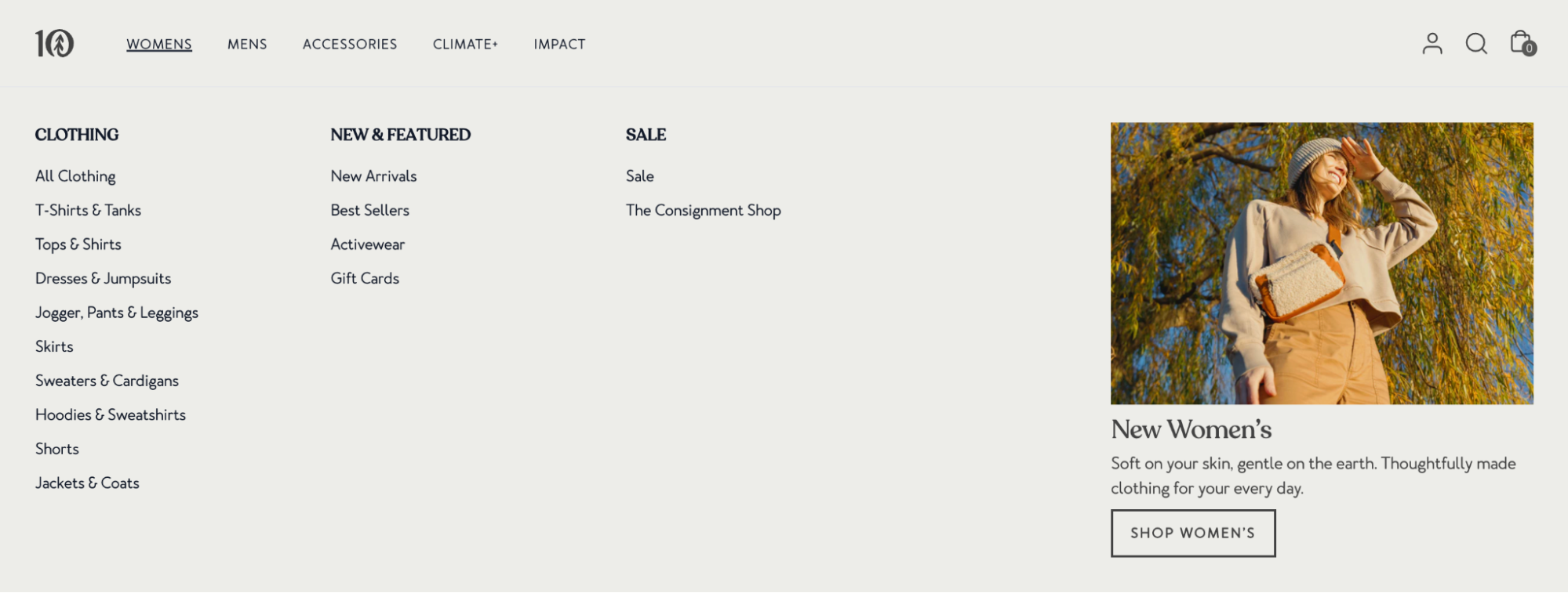
Tentree’s main navigation highlights five primary sections: Womens, Mens, Accessories, Climate+, and Impact. The first three represent the store’s core product categories, immediately signalling what shoppers can buy, while the latter two communicate brand initiatives. This keeps the primary navigation focused on product discovery while still leaving room for brand storytelling.
Inside the Women's dropdown, product groups such as T-Shirts & Tanks, Dresses & Jumpsuits, Joggers, Pants & Leggings, and Jackets & Coats use clear, product-specific labels that match how shoppers typically search for clothing categories. This makes it easy for visitors to scan the menu and enter the relevant product section quickly.
At the same time, the large “New Women’s” visual block on the right highlights a key commercial collection. Rather than competing with core categories in the menu list, it uses a dedicated visual area to draw attention to new arrivals. This approach allows the store to promote business priorities while keeping the main category structure clean and easy to scan.
Organise category navigation so shoppers can move easily between product groups
Category navigation is the set of links and groupings within category and product listing pages (PLPs) that help shoppers move between related product groups. Usually placed as a sidebar menu or sub-category links at the top of a category page, it guides users deeper into the catalogue after entering a department.
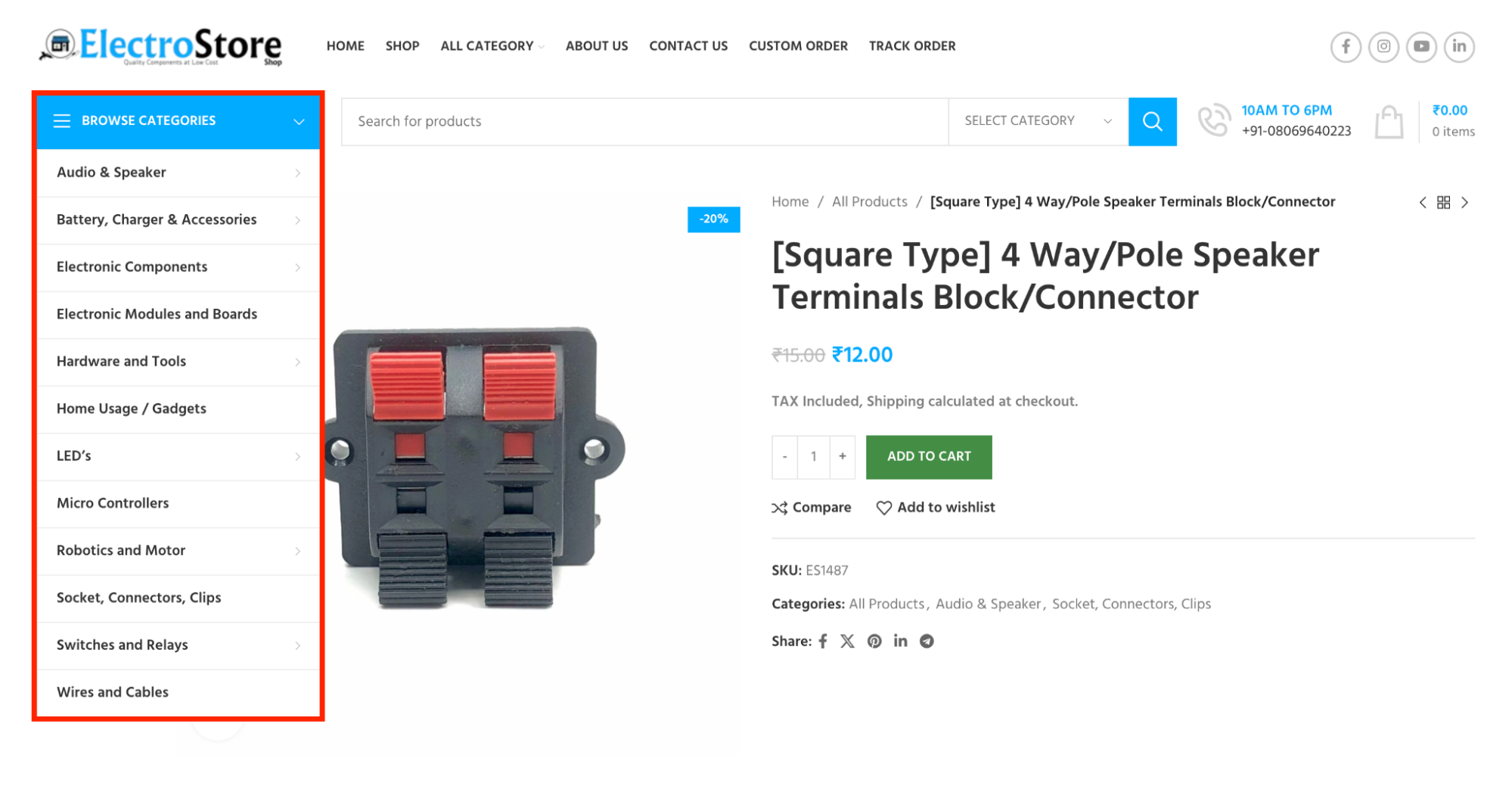
Apart from structuring categories based on customer search behaviour and then prioritising them according to commercial importance (similar to how you design the main navigation), there are 2 additional practices to consider when optimising category navigation:
-
Surface sibling categories within the same hierarchy: Sibling categories are categories that sit at the same level within a navigation hierarchy and represent closely related product types (e.g., Running Shoes, Trail Shoes, Hiking Boots under “Footwear”). Displaying these categories together in navigation allows shoppers to easily switch between related product groups, supporting comparison behaviour without returning to the main menu.
-
Use progressive disclosure to surface additional product groups and priority collections: Category navigation should reveal deeper options only when they become relevant, such as expanding subcategories after a shopper selects a parent category. This layered structure keeps the interface scannable while creating space to introduce commercially important collections like “Best Sellers” or “New Arrivals” without overcrowding the primary navigation.
-
Keep the category hierarchy within three levels: Structure category navigation so product groups remain within 3 hierarchical levels. A simplified hierarchy helps search engines understand the relationship between categories and distribute ranking signals more effectively.
Design filter navigation that helps narrow large product lists
Filter navigation refers to the set of attribute-based controls displayed on Product Listing Pages (PLPs) that allow shoppers to refine large product lists. These filters typically appear as a sidebar or horizontal bar alongside product grids and include attributes such as price range, size, colour, material, brand, ratings, or availability.
According to Baymard Institute, optimised filtering and sorting tools reduce abandonment to 17-33% among users searching for the same product type, compared with 67-90% on sites with poorly optimised filtering.
-
Prioritise filters based on shopper needs: Place the most commonly used filters (such as Size, Price, and Brand) at the top of the sidebar so customers can quickly narrow down options using the attributes that matter most. Less critical or technical filters can be grouped under a secondary layer, such as a “Show More” toggle, to keep the interface focused and easy to scan.
-
Display real-time product counts next to every filter option: Show values such as "Blue (12)" or "Large (5)" to give shoppers immediate visibility into how many products match each filter. This helps users quickly evaluate which options are worth exploring and avoid selecting filters that return very few or no results.
-
Place campaign or high-value attributes within the filter set: Temporarily surface filters that align with commercial priorities, such as “On Sale,” “New Arrivals,” or “Sustainable Materials,” during promotional periods or campaigns. Placing these attributes near the top of the filter panel increases visibility and helps guide shoppers toward strategic product groups without disrupting the primary filters customers rely on.
-
Define how filtered URLs are generated when users apply filters: When shoppers apply filters such as colour, size, or price, the site generates a URL representing those selections. Use crawlable URL structures such as query parameters (/running-shoes?color=blue) or path segments (/running-shoes/blue) to help search engines understand the product attributes behind each page. Don’t use fragments (e.g. #blue), which search engines typically ignore. Note that while these URLs help convey product variations, many filter-generated URLs should not be indexed directly to prevent duplicate content issues, but they can still be useful for crawling and internal linking.
Example: How REI uses filters to manage large product catalogues
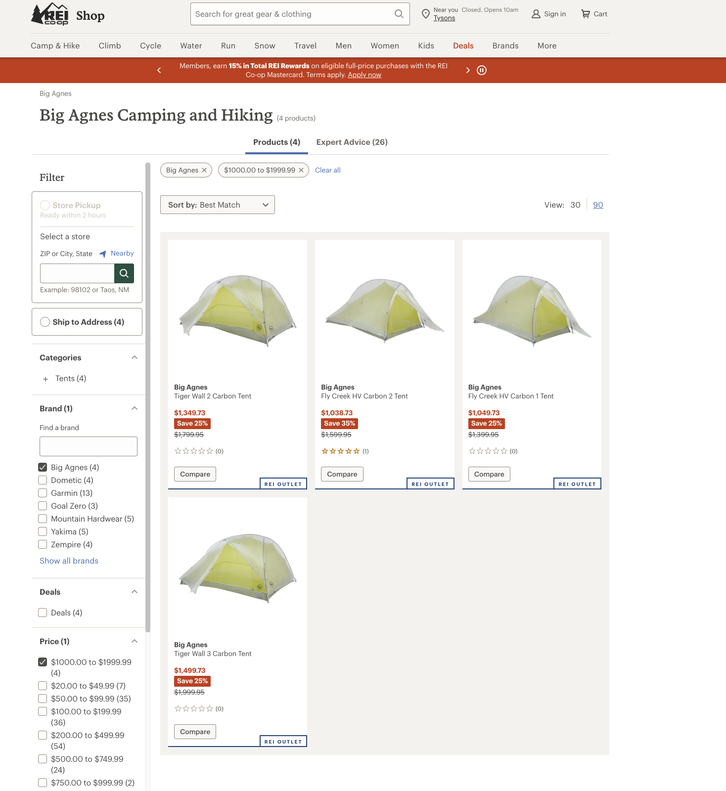
REI provides a strong example of how filter navigation can support product discovery in categories containing hundreds of products.
In categories such as hiking backpacks, the store provides filters based on attributes shoppers commonly consider when choosing gear, including capacity, brand, gender fit, weight, and price. These attributes reflect the criteria customers typically use when comparing outdoor equipment, allowing shoppers to quickly narrow large product lists.
The filters also allow multiple attributes to be combined. For example, a shopper interested in premium ultralight tents can select the Big Agnes brand and apply a price filter between $1,000 and $1,999, immediately narrowing the product list to a few relevant options.
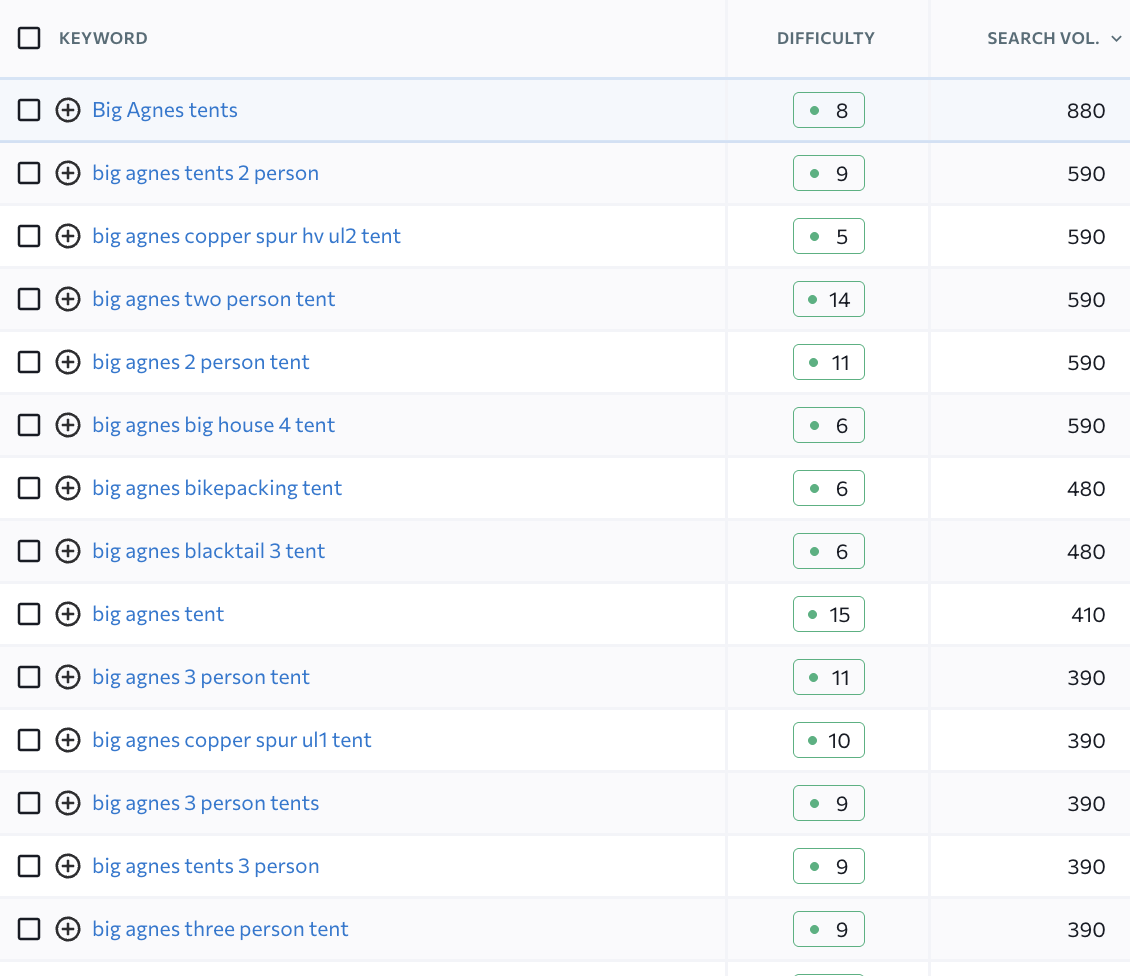
From an SEO perspective, REI groups its products by brand within its catalogue structure, allowing shoppers to filter results to brands such as Big Agnes. Brand-based product groupings like this also reflect real search demand. For example, the query “Big Agnes tents” receives roughly 800-900 searches per month, allowing REI’s product listing pages to capture relevant organic traffic.
Optimise site search to provide a direct path to relevant products
Site search is a functional input field typically located in the global header or the top right corner of the website. Unlike hierarchical menus, it offers a "shortcut" for high-intent shoppers who already know what they want. Site search is critical for the shopping experience because searchers are statistically 2-3 times more likely to convert than casual browsers.
-
Make the search bar wide enough for full queries: Customers frequently enter multi-word or complex queries (e.g. waterproof breathable running jacket). A sufficiently wide input field allows users to see their full query at a glance, improving input accuracy, reducing typos or premature submission errors, and enabling more precise result matching.
-
Enable real-time autocomplete & predictive search with rich previews: Start suggestions after 2-3 characters, update dynamically as users type. Show text expansions plus thumbnails, prices, and key attributes in the dropdown. This reduces typing effort, lowers friction, guides queries toward relevant results, and boosts click-throughs, accelerating the path to purchase.
-
Configure no-results experience to prevent dead-end pages: When queries return no direct matches, provide intelligent corrections, 'did you mean' suggestions, and relevant categories or related product groups based on synonyms. Include curated recommendations based on browsing history or behaviour to guide users toward alternatives. This keeps high-intent shoppers engaged, encourages continued discovery, reduces abandonment, and prevents forcing a session restart or exit.
-
Limit indexing of search result pages to those with SEO value: Most search result pages generated from user queries should be blocked from indexing to avoid creating large volumes of thin or duplicate pages. However, when certain search queries consistently reflect strong product demand, consider converting those queries into structured categories or landing pages that can be indexed and optimised for search engines.
Example: How Sephora’s predictive search guides shoppers
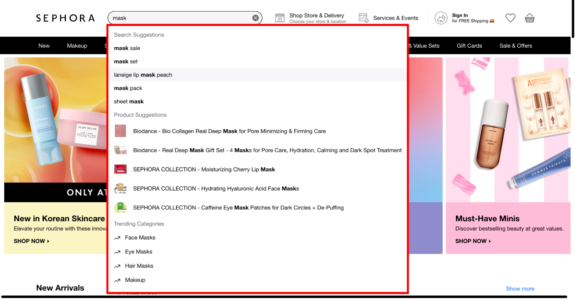
When users type a query such as “mask,” Sephora immediately surfaces layered autocomplete suggestions that guide shoppers toward relevant results. The dropdown first expands the query with common search refinements (e.g., mask sale, mask set, sheet mask), helping users quickly refine intent without typing the full phrase. It then displays product suggestions with thumbnails, allowing shoppers to visually scan items like collagen masks or lip masks before even opening a results page.
Importantly, the interface also surfaces related categories such as Face Masks, Eye Masks, and Hair Masks. This structure allows shoppers to pivot between product types directly from the search dropdown, reducing friction and accelerating the path from query to product discovery.
For those looking to dive deeper into site search strategies, explore more in our guide: eCommerce site search: Best practices to improve UX and drive more sales.
|
Partner with On Tap’s eCommerce development service to transform your internal search into a revenue engine. We specialise in deploying search tools that predict user intent, reduce friction, and increase sales by delivering immediate, relevant product results. |
Use breadcrumb navigation to expose the catalogue hierarchy across pages
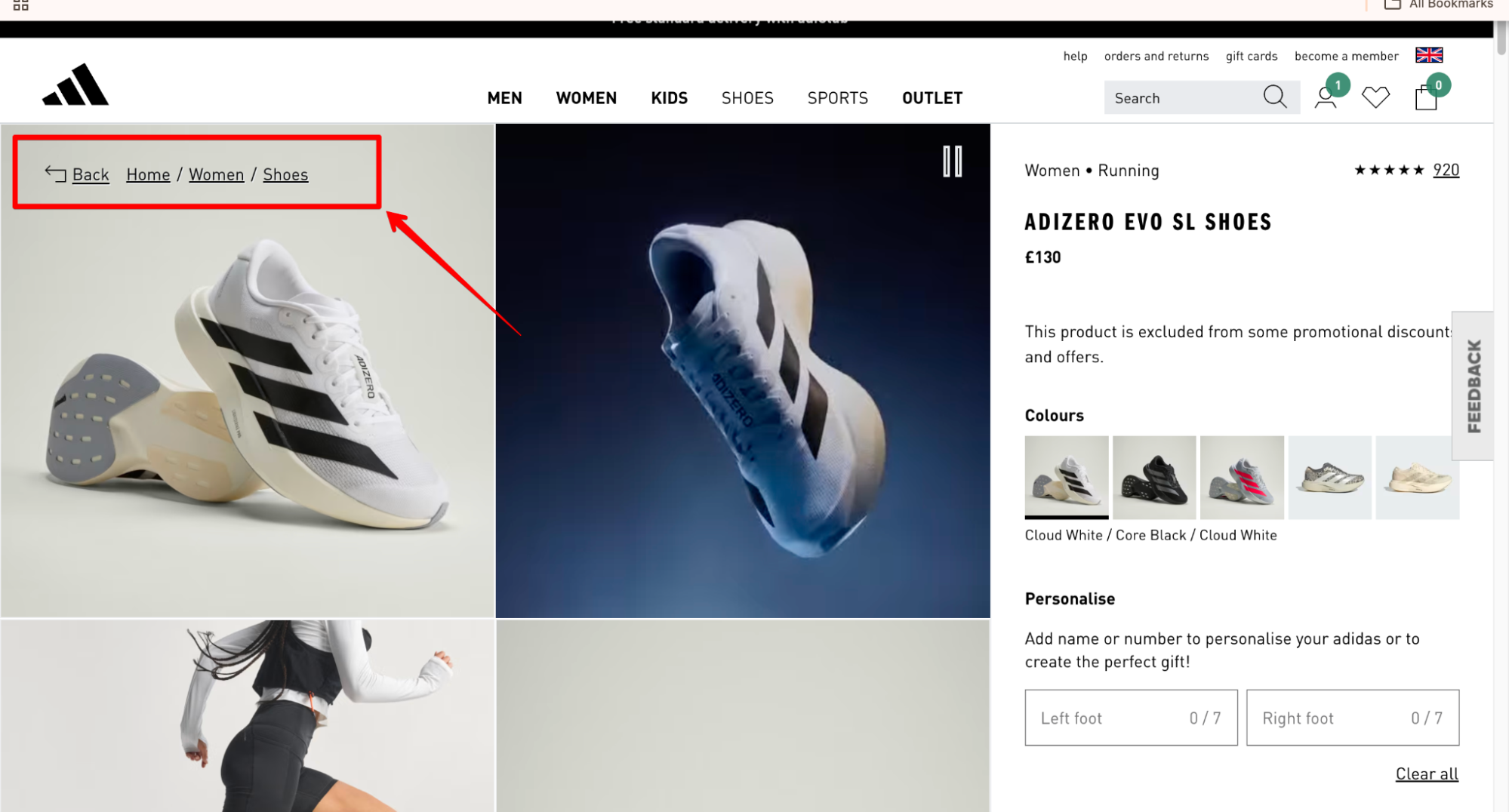
Breadcrumb navigation is a secondary navigation element that shows the hierarchical path from the homepage to the current page. It typically appears near the top of Product Listing Pages (PLPs) and Product Detail Pages (PDPs), displaying a clickable trail such as Home > Women > Shoes. This structure allows shoppers to see where they are in the catalogue and quickly return to broader categories without restarting their browsing journey.
-
Show the complete hierarchical path starting from the Homepage: Up to 40% of shoppers land directly on PDPs from search engines, ads, or social links. Displaying a breadcrumb path helps them quickly understand where the product sits within the catalogue and move upward to explore related categories. For example, a breadcrumb may appear as Home > Category > Sub-category > Product, allowing users to step back into broader product groups without restarting their search.
-
Display only one most relevant category path: A single product may appear in several collections (for example: Running Shoes, Men’s Shoes, or New Arrivals). Showing every possible path can make breadcrumbs unnecessarily long and confusing. Select the primary merchandising or structural category for the breadcrumb trail so the hierarchy remains clear and easy to scan.
-
Implement BreadcrumbList structured data using JSON-LD: Add structured data markup so search engines can interpret breadcrumb paths programmatically. The recommended format is JSON-LD, which separates structured data from page layout and reduces the risk of breaking during design updates.
Link related items and sections within key pages
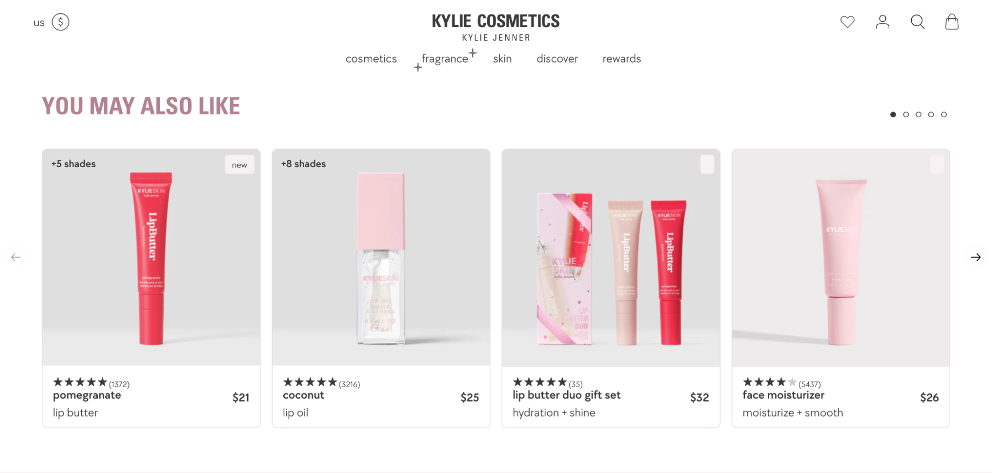
Linking related items and sections refers to internal links placed directly on key pages, most commonly Product Detail Pages (PDPs) and cart pages, to surface additional relevant products or categories. In practice, this usually appears as sections like “Frequently bought together,” “You may also like,” or “Related categories,” placed near the product details or below the main content. Beyond helping users discover additional options within the same context, these links also guide shoppers toward complementary products, supporting cross-selling opportunities and increasing average order value while strengthening internal linking signals for SEO.
-
Implement complementary product bundling to increase Average Order Value (AOV): In many purchase journeys, customers first select a primary item, while related or accessory products are considered later. To increase conversion rates and drive higher average order value, display modules such as “Frequently bought together” or “Complete the set” near the Add to Cart area. Group products by logical use cases or compatibility so customers can easily add relevant items at the point of decision.
-
Provide alternative product suggestions to reduce bounce rates: If a specific item does not meet a user's requirements, users need to return to category pages or filters to continue browsing, adding extra steps that increase drop-off risk. To reduce this friction and increase the likelihood that browsing sessions convert into purchases, display a section like “Similar items” or “You may also like” directly on the product page. Populate this with products that share key attributes such as category, price range, or core specifications, so users can quickly switch to a more suitable option without leaving the page.
-
Utilise keyword-rich anchor text for cross-links to strengthen topical authority: Search engines rely on the text within a link to understand the relevance and content of the destination page. Use anchor text that clearly describes the topic of the linked page and aligns with the search intent of that section. When relevant, incorporate search-demand keywords, such as “Browse Waterproof Hiking Boots,” instead of generic phrases like “Click here.” Clear, descriptive anchors help search engines interpret the relationship between pages and improve the ranking potential of deeper category sections.
Structure footer navigation to surface supporting information and secondary sections
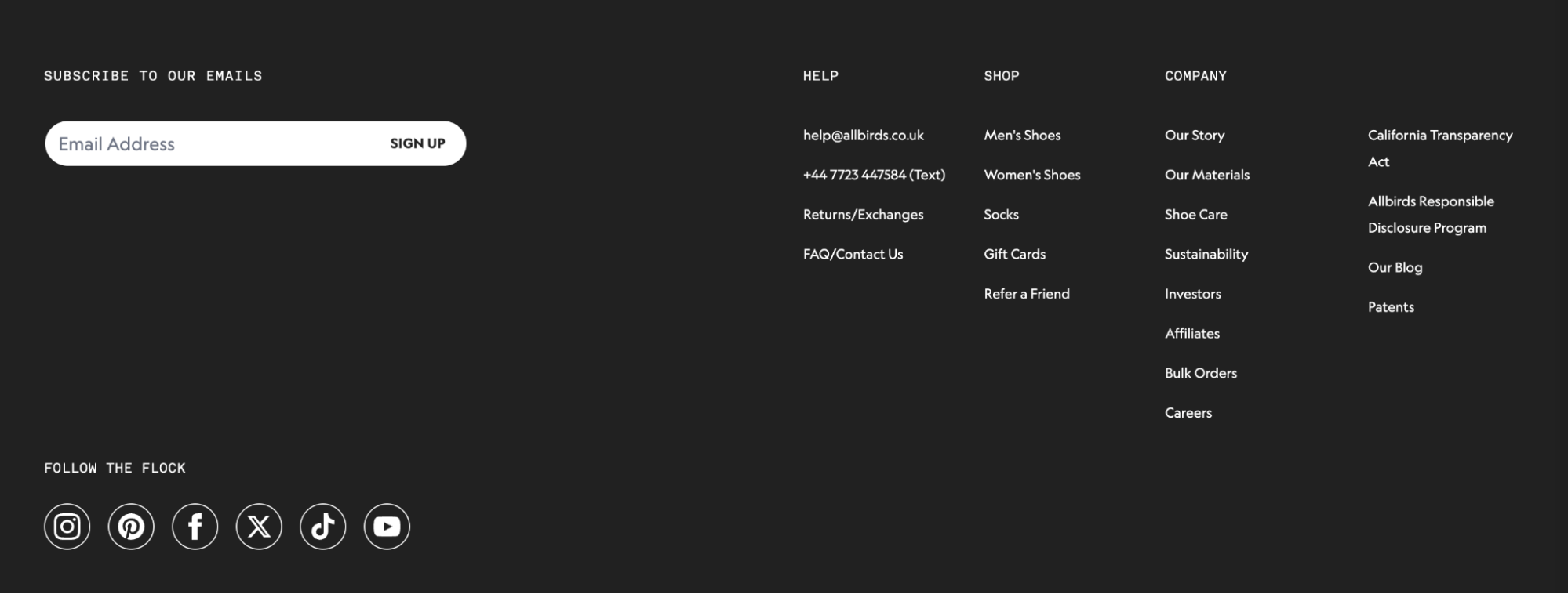
Footer navigation is the section of a website typically placed at the bottom of every page, designed to provide access to supporting content and secondary sections. Its role is to guide users to important but non-primary pages (such as policies, FAQs, contact information, or resource hubs), enhancing overall site structure, discoverability, and usability.
-
Organise secondary links into logical, thematic columns with bold headers: Grouping links under clear headings such as Help, Shop, and Company allows users to scan the entire section in seconds. This structure provides a clear path for high-anxiety queries about returns, contact details, or order tracking, helping maintain customer trust and preventing the frustration that leads to site abandonment.
-
Integrate active lead generation tools to capture departing traffic: To support long-term business priorities, place a high-contrast email subscription field or a "Refer a Friend" link in a prominent position within this section. This transforms a passive area of the page into an active marketing channel, allowing you to build your marketing list and re-engage shoppers who were not ready to buy during their initial visit.
-
Use descriptive, keyword-aligned anchor text for sitewide footer links: Footer links appear across the entire site, so the anchor text helps search engines understand which sections are most important. Use clear, descriptive labels that reflect the destination page’s topic, and link to relevant supporting sections such as category pages, buying guides, or store policies. This sitewide linking structure improves crawl paths while reinforcing the topical relevance of key pages.
Adapt navigation patterns for mobile browsing behaviour
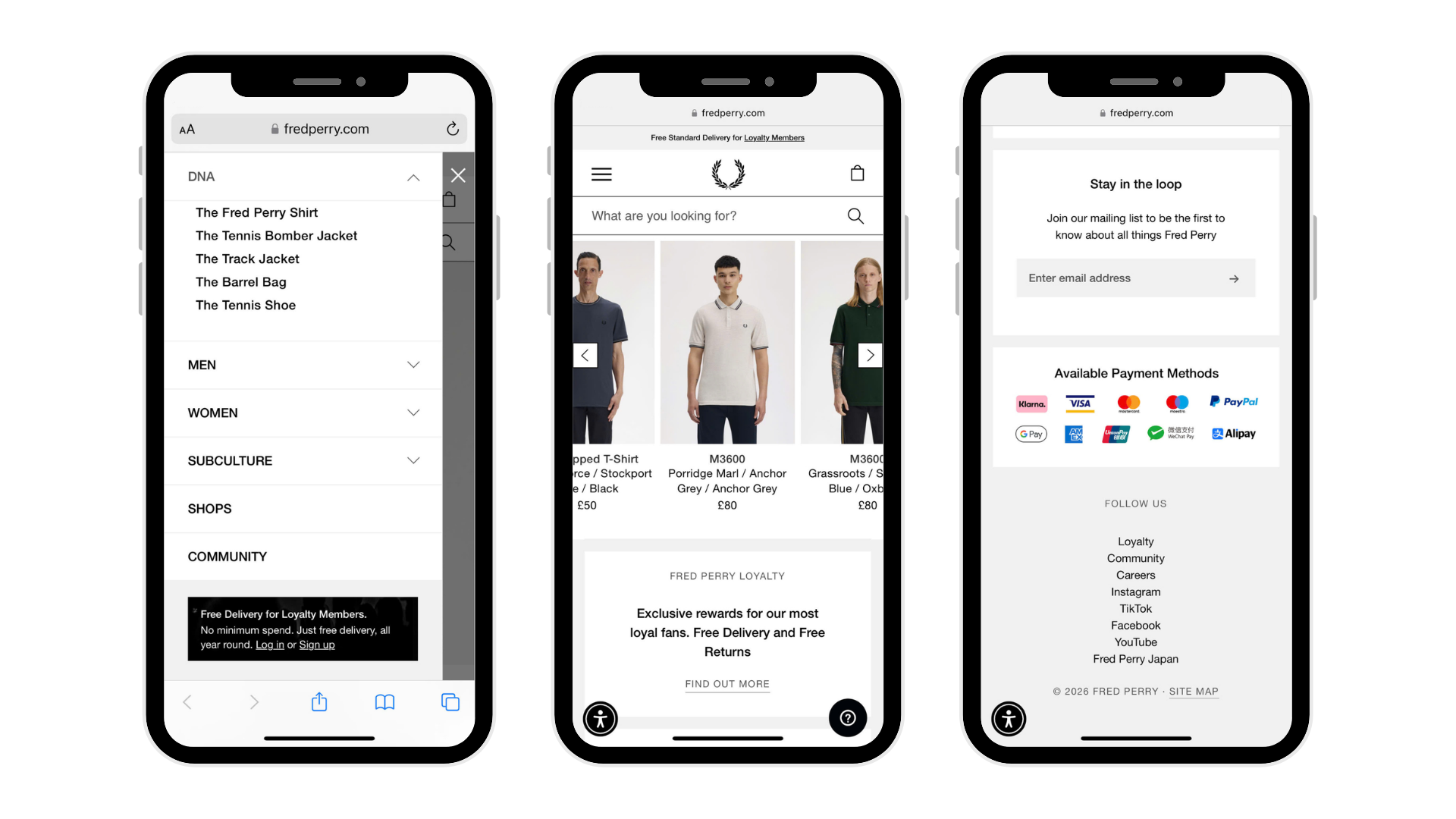
Mobile navigation refers to the menus, links, and interactive elements specifically designed for users browsing on smartphones or tablets. Its role is to provide intuitive, touch-friendly access to key site sections and products, ensuring smooth navigation despite smaller screens. Mobile navigation is typically placed at the top (hamburger menu, sticky header) or bottom (tab bar) of mobile pages.
Mobile devices now generate around 75% of eCommerce website traffic, yet navigation performance on many mobile sites still ranks as mediocre or poor.
-
Prioritise mobile-friendly navigation with bottom-thumb placement, tab bars for main sections, and hamburger menus for secondary options: Positioning primary elements within easy thumb reach and limiting visible menu items reduces cognitive load. Adequate touch spacing and familiar icons make interactions intuitive, helping users navigate efficiently, find products faster, and enjoy a frustration-free mobile browsing experience.
-
Implement sticky navigation and sticky Add-to-Cart elements on mobile and product pages: Keep search, cart, and filters always visible in the header or footer, and display a sticky Add-to-Cart with price and quantity on product pages (bottom sheet on tap). This reduces scrolling friction, encourages impulse purchases, and can boost add-to-cart clicks by 11.8% (according to A/B tests on mobile PDP by Growth Rock).
-
Optimise mobile page speed and performance to improve SEO: Compress and resize images, minify CSS/JS, defer non-critical scripts, and implement browser caching. Use lazy loading for offscreen content and monitor Core Web Vitals regularly. These actionable steps ensure fast-loading pages on mobile, reduce bounce rates, and signal Google that your site provides a smooth, high-quality mobile experience.
|
Need help turning eCommerce navigation improvements into measurable results? With more than 20 years of eCommerce experience, On Tap supports brands in strengthening product discovery, site structure, and conversion performance across multiple eCommerce platforms. Our work with TEMPLESPA was recognised at the 2025 eCommerce Awards, where the project received industry recognition and On Tap was also awarded two Silver awards. Get in touch with our team to discuss how we can support your eCommerce growth. |
How to evaluate and improve your website navigation
Even well-designed navigation systems can become harder to use over time as product catalogues expand, new pages are added, and merchandising priorities shift.
Regularly reviewing how customers move through the site helps merchants identify structural issues that may slow exploration or hide important pages within the catalogue. These issues are often subtle and only become visible when navigation is evaluated across the entire browsing experience rather than through individual page elements.
|
On Tap helps merchants evaluate their navigation architecture, catalogue structure, and customer browsing behaviour through our eCommerce consultancy services. Our team then supports merchants with navigation improvements, structural optimisation, and ongoing performance refinement to ensure the site structure continues to enable product discovery and conversion. |
The following checks can help merchants identify opportunities to strengthen their eCommerce navigation and make it easier for customers to move through the store:
|
Navigation signal |
Metrics to review |
Tools (examples) |
Possible underlying issues |
Potential navigation improvements |
|
Main navigation engagement |
Click-through rate of top navigation items |
Google Analytics / GA4, AuditIQ (Analytics feature) |
Categories may be unclear, menu items may be poorly prioritised, or navigation labels may not match how customers search for products |
Simplify the main navigation, prioritise high-demand categories, and replace unclear labels with product-focused terminology |
|
Category entry rate |
% of sessions that enter the catalogue through category pages |
GA4 Landing Page reports |
Key product categories may not be visible enough in navigation or homepage entry points |
Surface core product categories more prominently in the main navigation or homepage navigation blocks |
|
Search usage rate |
% of sessions using internal search |
GA4 site search tracking, Shopify analytics, Algolia analytics |
Visitors may struggle to locate products through browsing, or category labels may not match common search terms |
Improve category naming, add clearer category entry points, or reorganise category structures |
|
Top search queries |
Most common internal search keywords |
GA4 site search reports, search platform analytics |
Missing categories, poorly labelled navigation sections, or products that are difficult to locate through browsing |
Create new category pages, refine navigation labels, or expose popular product groups earlier in navigation |
|
Category page engagement |
Bounce rate, exit rate, time on category pages |
GA4 Behaviour reports |
Category structures may not match browsing behaviour, or product listings may not help users narrow options efficiently |
Refine category groupings, improve filtering options, or reorganise product attributes |
|
Navigation drop-off points |
Pages where users frequently leave the site while browsing |
GA4 User Flow / Path exploration reports |
Navigation paths may be confusing or require too many steps to reach products |
Simplify navigation paths, strengthen links between related categories, or reduce unnecessary navigation layers |
|
Mobile navigation behaviour |
Menu open rate, navigation clicks on mobile devices |
GA4 device segmentation, Hotjar session recordings |
Mobile navigation may be difficult to use, or key categories may be hidden too deeply in menus |
Simplify mobile menus, surface key categories earlier, and ensure search and filters are easily accessible |
Once breadcrumbs and structured data are in place, ongoing monitoring helps ensure they remain intact. AuditIQ eCommerce monitoring tool continuously scans for technical SEO issues such as missing or broken breadcrumb markup, so hierarchy signals stay consistent for both users and search engines.
Conclusion
eCommerce navigation shapes how easily shoppers explore your catalogue, understand product relationships, and move toward purchase. From the main menu and category structure to filters, related links, and mobile navigation, each element influences how efficiently products are discovered and how clearly search engines interpret your site.
The practices outlined in this guide help merchants build clearer catalogue structures, reduce browsing friction, and strengthen both product discovery and SEO performance.
For over 20 years, On Tap has helped eCommerce brands improve conversion performance across multiple platforms. As an award-winning eCommerce agency, we combine structured diagnostic analysis with practical implementation to ensure eCommerce navigation, product discovery, and overall site experience contribute to measurable commercial growth.
If you want to strengthen your eCommerce navigation and better align user experience, search visibility, and commercial priorities, explore our digital marketing services or contact our team to discuss your current eCommerce performance and growth objectives.