You already have traffic coming to your store. The next growth lever is converting more of those visitors into customers. This guide focuses on practical, proven improvements you can apply directly to your existing eCommerce website, without needing a full redesign or complex experimentation.
The tactics presented here are informed by over 20 years of hands-on eCommerce optimisation experience and supported by recent market research on shopper behaviour and conversion drivers. Each tactic targets a specific friction point in the buying journey, from the first click to checkout completion, so you can prioritise changes that deliver measurable impact quickly.
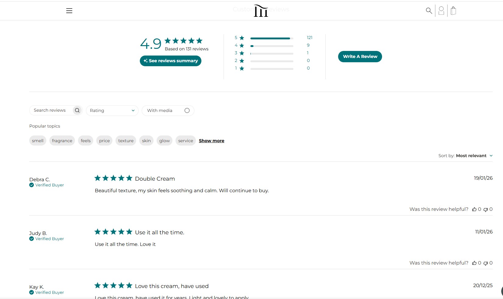
What is the eCommerce conversion rate?
The eCommerce conversion rate represents the proportion of visitors who complete a purchase on your store. For example, if your store receives 12,000 visitors and generates 350 orders, the conversion rate is 2.9%.
From a performance and optimisation perspective, there is no single “good” conversion rate that applies to every store. Conversion levels vary significantly depending on industry, product type, device mix, and traffic quality. For a detailed breakdown of conversion rate benchmarks by industry and traffic source, see our comprehensive eCommerce conversion rate guide.
Note: This article focuses on consumer-facing (B2C) eCommerce stores. If your business sells primarily to other businesses, conversion behaviour, checkout requirements, and success metrics differ significantly. You can find a dedicated breakdown in our B2B eCommerce conversion rate guide.
17 best practices to improve eCommerce conversion rate
|
No. |
Best practices |
How to apply |
|
1 |
Align ads and traffic messaging with on-site content |
|
|
2 |
Communicate a clear value proposition on the homepage |
|
|
3 |
Simplify primary navigation so shoppers can find products faster |
|
|
4 |
Make on-site search tolerant of typos and vague queries |
|
|
5 |
Personalise the shopping experience |
|
|
6 |
Use product media to show detail, scale, and real-world use |
|
|
7 |
Use comparison cues for similar products |
|
|
8 |
Highlight key differentiators instead of listing all features equally |
|
|
9 |
Improve load speed on high-intent pages |
|
|
10 |
Add user-generated content to answer buying questions |
|
|
11 |
Show delivery timelines, returns and guarantees before checkout |
|
|
12 |
Use live chat or AI chat for last-minute questions |
|
|
13 |
Remove friction in checkout experience to prevent last-step drop-off |
|
|
14 |
Use exit-intent offers selectively |
|
|
15 |
Use contextual upsells and cross-sells |
|
|
16 |
Retarget product viewers with relevant paid ads |
|
|
17 |
Recover abandoned carts via email or SMS |
|
Below, we will share a real-world case study of TEMPLESPA – a long-standing client who has clearly witnessed conversion growth after receiving CRO support from On Tap.

Align ads and traffic messaging with on-site content to avoid expectation mismatch
One of the most common causes of poor conversion is not weak traffic, but broken intent continuity. When shoppers click an ad, email, or organic result with a clear promise in mind but encounter different language, offers, or product framing, trust drops before meaningful engagement begins.
A typical signal of this problem is stable traffic but declining landing-page engagement and conversion, indicating that the first screen fails to validate the visitor’s original intent. As a result, advertising spend is wasted because brands still pay for clicks that are abandoned immediately.
Ultimately, messaging consistency is a decisive factor in whether initial interest turns into actual purchase behaviour.
How to apply this tactic
-
Mirror the ad promise and messages in the first screen: Repeat the exact offer, product type, key benefit, and main wording used in the ad in the landing page headline and hero section. The visitor should immediately recognise that the page matches what they clicked for.
-
Match visuals and featured products: If the ad shows a specific product, variant, or collection, the landing page must feature the same item first, rather than a generic category or mixed assortment.
-
Align the CTA with the ad’s intent: If the ad is designed to drive a purchase, the landing page should present a clear purchase-focused CTA instead of a discovery or informational action.
-
Create separate landing pages by campaign intent: Do not reuse one landing page for search, social discovery, and remarketing traffic. Build intent-specific pages so each page reflects the context and motivation behind the click.
-
Validate the promise immediately next to key buying information: Display discounts, free shipping, returns, or limited-time offers directly beside the price or product summary, not deeper in the page.
Communicate a clear value proposition on the homepage
A clear value proposition on the homepage allows visitors to immediately understand who the site is for and what concrete value it delivers. When this message is easy to grasp at first glance, users can quickly judge relevance and are more likely to continue exploring instead of leaving.
It also reduces uncertainty in the decision-making process. By clearly showing how the offer benefits the user and why it is different from alternatives, the homepage builds confidence and increases the likelihood that visitors move forward to key actions such as browsing products, adding to cart, or signing up.
How to apply this tactic
-
Define a focused customer promise: Clearly state who your target audience is, what main problem you solve, what type of products are sold, and the primary outcome they can expect.
-
Highlight only the most meaningful differentiators: Focus on one or two advantages that genuinely influence purchase decisions.
-
Place the message on the first visible screen: Display the value proposition above the fold with a short, direct headline and a supporting subheadline that explains the benefit in plain language.
-
Translate features into business benefits: Express your offering in terms of outcomes such as saving time, increasing revenue, improving efficiency, or enhancing the customer experience, rather than listing technical features.
-
Reinforce the promise with trust signals: Add concise proof elements (testimonials, customer logos, key metrics, or certifications) close to the value proposition to strengthen credibility and reduce hesitation.
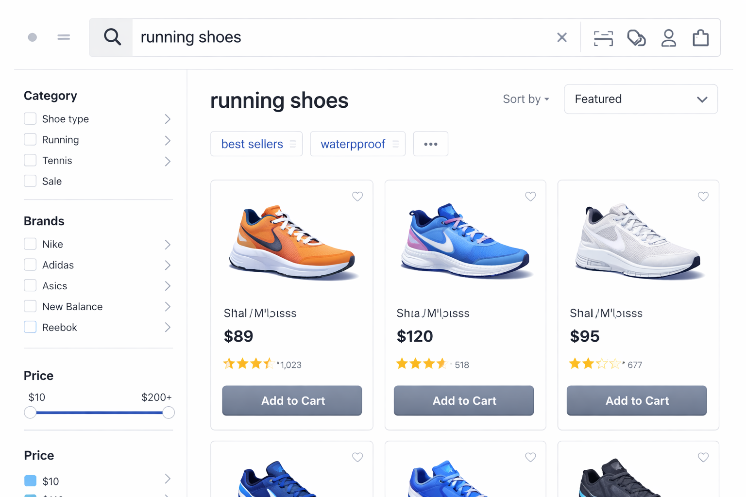
Simplify primary navigation so shoppers can find products faster
Primary navigation determines how quickly shoppers can move from interest to relevant products. When menus are overloaded, category names mirror internal merchandising structures, or the hierarchy does not match customer browsing behaviour, users are forced to pause and interpret the interface rather than progress.
This friction interrupts exploration at the earliest stage of the journey. If shoppers cannot immediately recognise where their products live, they are far less likely to reach product listings or detail pages where commercial decisions are actually made.
How to apply this tactic
-
Structure the primary menu around buying intent: Organise categories based on how customers search for and select products, rather than on internal merchandising or operational structures.
-
Limit top-level navigation to essential product ranges: Keep only the most important product groups in the first navigation layer so users can immediately understand what the store offers.
-
Expose relevant sub-categories directly from the main menu: Allow shoppers to access key sub-categories from dropdown or mega menus without forcing additional intermediate clicks.
-
Provide a dedicated sitemap for complex catalogues: When your range and structure are large, a clear and human-readable sitemap gives shoppers a fast fallback path to locate products without navigating multiple menu levels.
-
Combine global and in-page navigation: Use filters, secondary menus, and in-page navigation to support the shopper’s current discovery stage, so navigation adapts as users move from broad browsing to focused product selection.
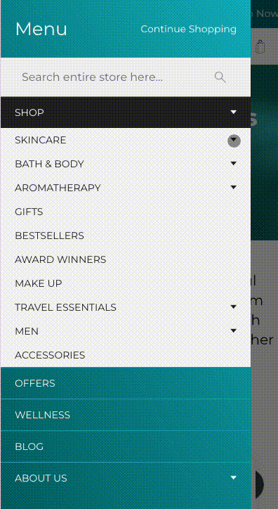
Example – TEMPLESPA and navigation clarity
Through work delivered by On Tap, TEMPLESPA’s primary navigation was refined to better reflect how customers browse and select skincare products. The menu clearly groups products by Category, Skin Type, and Skin Concern, while also surfacing high-intent collections such as Bath & Body, Aromatherapy, Gifts, Best Sellers, Award Winners and Travel Essentials. By prioritising commercially important paths and clarifying category labels, the navigation helps shoppers reach relevant product ranges faster, reducing early-stage friction and improving progression into product discovery.
Make on-site search tolerant of typos and vague queries
On-site search is most often used by shoppers who already have a product, brand, or specification in mind. When the search engine cannot handle spelling errors, partial terms, or loosely defined queries, the site creates friction at one of its highest-intent entry points.
More critically, weak search relevance leads users to conclude that a product is unavailable, even when it exists in the catalogue. This results in immediate lost revenue from customers who were already prepared to move into evaluation or purchase.
How to apply this tactic
-
Enable typo and spelling tolerance in the search engine: Configure the system to recognise common typing errors and variations so relevant products are still returned.
-
Match search queries against product configuration and attribute data: Allow the search engine to match each keyword directly to structured product data (such as configurable attributes, variants, specifications, and options), so multi-term and descriptive searches return the correct products without relying on manual synonym or category mapping.
-
Use the search results layout to support fast refinement: Provide filtering and sorting options that help users narrow their selection without rewriting the query.
Personalise the shopping experience
Personalisation improves conversion by reducing the amount of irrelevant content a shopper must process before reaching suitable products. When recommendations, category ordering, and product suggestions reflect a visitor’s recent behaviour, the journey becomes more focused and decision-making becomes faster.
This approach also directly influences purchase intent. Research indicates that around 80% of consumers are more inclined to buy from brands that deliver experiences tailored to their interests and context, reinforcing the role of personalisation as a practical driver of engagement and conversion.
How to apply this tactic
-
Use behavioural signals as the primary input: Base personalisation on viewed products, categories, and search activity rather than inferred demographics.
-
Apply personalisation to discovery layers: Personalise category ordering, product recommendations, and merchandising blocks.
-
Support faster completion with smart personalisation: Enable pre-filled addresses and saved payment details at checkout, and surface highly relevant add-on or complementary product suggestions without interrupting the payment flow.
-
Preserve a clear default structure underneath: Ensure personalised components do not hide or replace standard navigation and product access paths.
Use product media to show detail, scale, and real-world use
Product media replaces physical inspection in online shopping. When shoppers cannot clearly see key details, understand size and proportion, or visualise real-world usage, confidence drops and decision-making slows.
In real buying behaviour, visual and interactive media (image galleries, videos, and 360° views) are consistently among the most interacted-with elements on a product page. When this media does not provide enough clarity, shoppers often leave the site to look for external photos or videos, and many do not return.
Well-designed product media reduces uncertainty at the evaluation stage by answering practical questions that text alone cannot resolve, such as appearance, texture, scale, and real-life context.
How to apply this tactic
-
Use high-resolution imagery to reveal product detail: Allow shoppers to inspect materials, finishes, and functional elements through clear, zoomable images. If performance is a concern, apply the media optimisation practices in Point 3 to maintain both image quality and page speed.
-
Provide clear and consistent scale references: Use models, hands, or reference objects so size and proportion are easy to interpret across both images and video.
-
Use need-driven media by product type: Identify what customers need to see to confidently choose each product, and provide the appropriate media formats (close-ups, lifestyle images, demonstration videos, comparison views, and 360° or spin images) that directly support those decision needs.
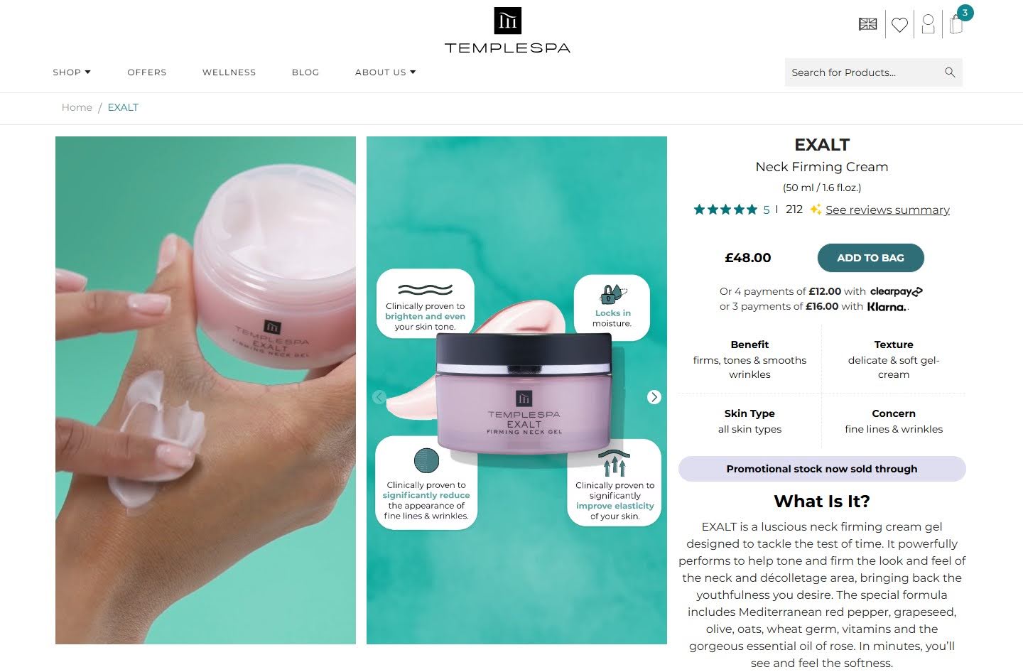
Example – TEMPLESPA
On TEMPLESPA’s product pages, each product is supported by a combination of high-quality images and product videos. Close-up pack shots and visual callouts highlight key ingredients and formulation benefits, while texture-focused visuals show how the product looks and applies in real use. In addition, short videos demonstrate application and usage in context, helping shoppers better understand how the product performs in real life.
This mix of imagery and video makes size, texture, and usage easier to interpret, shortens evaluation time, reduces uncertainty around suitability and application, and helps shoppers reach a purchase decision faster, directly supporting higher add-to-cart and conversion rates.
Use comparison cues to help shoppers choose between similar products
A common friction point on category and product listing pages is decision overload. When shoppers are presented with several similar products but are not given clear guidance on how those options differ, evaluation becomes slow and mentally demanding.
Comparison cues reduce cognitive effort by highlighting the few attributes that truly influence choice. This speeds up decision-making, strengthens confidence, and reduces the risk of hesitation or abandonment.
How to apply this tactic
-
Surface key comparable attributes directly in product listings: Display a small set of high-impact attributes (such as size, material, suitability, or performance level) directly on category pages and search results pages, so shoppers can scan and compare options without opening each product page.
-
Provide a lightweight comparison view for similar products: Offer a side-by-side comparison panel that can be opened from category and search results pages (for example, via a “Compare” action on product cards), also from the product detail page for closely related items. This view should compare only a small number of products using the attributes that actually influence purchase decisions.
Highlight key differentiators instead of listing all features equally
Once a shopper has opened a product page, the decision problem changes. The user is no longer comparing many options in parallel. They are evaluating whether this specific product is the right choice.
Most product pages fail at this stage because all features are presented with equal visual weight. This forces shoppers to scan long lists and interpret relevance on their own. In practice, users rarely read full specifications. They look for a small number of signals that justify the purchase.
By clearly surfacing the most important differentiators, the page guides attention and frames the decision around the strongest reasons to buy, increasing confidence and reducing hesitation.
How to apply this tactic
-
Identify and prioritise decision-driving attributes: Identify the 2–3 attributes that most influence purchase confidence in your category, using customer questions and behavioural data as signals. Display them on category pages through filters, tags, or key spec snippets so shoppers can quickly crawl, compare, and eliminate unsuitable options. On the product detailed pages, position them adjacent to price and CTA, reinforce them visually, and reduce competing elements that dilute attention.
-
Bring key differentiators closer to price and CTA: Place the strongest advantages near the purchase area so they guide the decision context.
-
Move secondary specifications into supporting sections: Make detailed technical information available without letting it dominate the initial decision space.
Improve load speed, especially on high-intent pages
Speed directly affects conversion when buying intent is highest. More than half of users abandon a page if it takes longer than three seconds to load, and even a one-second delay can reduce conversions by around 7%.
Slow pages create two different problems. At the product stage, delay increases bounce and interrupts evaluation. In the cart and checkout, visible lag increases perceived risk at the point of payment, weakening confidence and making abandonment far more likely.
How to apply this tactic
-
Evaluate performance separately for each high-intent page type: Measure product pages, cart pages, and each checkout step separately using Google PageSpeed Insights and Lighthouse, rather than relying on site-wide averages. This exposes bottlenecks that only appear at high-intent stages.
-
Use Core Web Vitals as your performance benchmark: Core Web Vitals are Google’s real-world user experience metrics that measure how quickly content loads (LCP), how responsive a page feels (INP), and how visually stable it remains (CLS). Because they reflect actual user behaviour rather than lab-based performance scores, they provide a more reliable benchmark for ecommerce optimisation. Track and optimise LCP, INP, and CLS across high-intent page templates to ensure real-world experience meets accepted thresholds, not just synthetic speed tests.
-
Optimise image and media delivery on product and cart pages: Reduce file weight, serve modern formats such as WebP, and apply lazy loading for below-the-fold assets. In addition, use dynamic image resizing via URL parameters so the same image is automatically delivered at the exact dimensions required for each placement (grid, gallery, zoom, thumbnail), avoiding oversized downloads.
-
Restrict third-party scripts on checkout pages: Remove or defer analytics, marketing, personalisation, and experimentation scripts that are not essential for transaction processing and that delay rendering or interaction during checkout.
Add user-generated content to answer buying questions
A major conversion blocker on product pages is unresolved buying uncertainty. Shoppers want reassurance that a product will perform in real life, not just in brand messaging. Today, more than 90% of online buyers consult reviews before purchasing, making social proof a baseline expectation rather than an optional feature.
User-generated content directly reduces this uncertainty. Reviews, customer photos, and Q&A clarify fit, quality, real usage, and common issues. Research shows that products displaying reviews can achieve conversion uplifts of up to 270% compared with products without visible reviews.
UGC also helps keep shoppers within the buying journey. When validation is available on the product page, visitors are less likely to leave the site to seek third-party opinions, reducing mid-funnel drop-off and maintaining purchase momentum.
How to apply this tactic
-
Place review signals next to core product information: Display star ratings and review counts beside the product title and price so social proof is visible before users evaluate details or scroll the page.
-
Expose buying questions directly on the page: Add a visible Q&A block under the main product information to address common objections such as suitability, sizing, usage, and compatibility without sending users elsewhere.
-
Show real usage through customer imagery: Collect and display customer-submitted photos within the product gallery or directly above the review section to demonstrate real-world context and outcomes.
-
Use AI to summarise reviews into key buying insights: Create short, scannable summaries of the most common benefits, drawbacks, and use cases so shoppers can quickly understand overall sentiment and make a decision with less effort.
Example
TEMPLESPA sells premium skincare products where trust and perceived results matter a lot to shoppers. Highlighting reviews, customer photos, and Q&A on product pages would help alleviate uncertainty and address common purchase questions, especially important because some customers report mixed experiences and concerns about product performance and value.
Show delivery timelines, returns, and guarantees before checkout
Delivery speed, return conditions, and guarantees are core risk factors in an online purchase. At the product and basket stage, shoppers focus on reducing uncertainty around fulfilment, flexibility, and post-purchase risk. Making these elements visible early allows customers to understand their commitment before entering checkout, reducing hesitation and strengthening confidence at the point of decision.
How to apply this tactic
-
Display key fulfilment and return messages on product pages: Position delivery estimates and return policies close to price and availability.
-
Use short, decision-focused wording: Communicate the essential conditions rather than full policy text.
-
Reconfirm guarantees on the basket page: Reinforce reassurance before users proceed to checkout.
Use live chat or AI chat to resolve last-minute buying questions
At the final decision stage, hesitation is rarely driven by a lack of interest. It is more often caused by a single unresolved and highly specific question, such as delivery cut-offs, product compatibility, usage constraints, or return eligibility.
Customer expectations strongly favour immediate, in-context support at this moment. 41% of shoppers prefer live chat over phone and email, making real-time assistance one of the most effective ways to remove last-minute friction.
How to apply this tactic
-
Expose chat access at decision points: Place chat entry points directly on product pages and within the checkout flow, and ensure messages are answered instantly so shoppers do not need to leave the page or pause the checkout process.
-
Design chat flows for buying support: Prioritise delivery cut-offs, product suitability, compatibility, usage, and returns, and deliver short, immediate answers that allow shoppers to continue their purchase without breaking flow.
-
Ensure escalation to human support when needed: When automation cannot resolve a question, route the conversation to a live agent immediately to avoid waiting delays that can trigger checkout drop-off.
Remove friction in checkout experience to prevent last-step drop-off
Checkout is the highest-intent stage of the journey, but it is also where purchase decisions are most easily disrupted. Once shoppers reach checkout, they are no longer judging the product itself, but whether the process feels easy, transparent, and safe to complete. Evidence shows that 26% of shoppers abandon when account creation is required, and 39% abandon when additional costs appear higher than expected, making unnecessary steps and late cost surprises two of the strongest triggers of last-minute drop-off.
When checkout removes these sources of friction and uncertainty, it supports completion rather than introducing new decisions, helping shoppers maintain confidence and progress smoothly to payment instead of dropping out at the final step.
|
To explore full practical strategies for improving checkout performance and increasing completed purchases, read our in-depth guide: eCommerce checkout optimisation: Improve conversion rate and boost sales. |
How to apply this tactic
-
Make checkout accessible without commitment: Set guest checkout as the default and remove any forced registration before payment. Invite account creation only after the order is completed and position it as optional.
-
Expose the real order cost before checkout: Show the full payable total, including shipping and taxes, in the cart or via an in-cart estimator. Update totals immediately when delivery options change and avoid adding new mandatory charges later.
-
Streamline the checkout flow for completion: Limit steps and fields to what is strictly required for fulfilment and payment. Combine related inputs, enable autofill, prioritise mobile usability, and show a clear progress indicator.
-
Offer and signal trusted payment options early: Select payment methods based on real transaction data and local preferences, and display available methods on product and cart pages, not only inside checkout.
Use exit-intent offers selectively to recover high-risk abandoning users
Cart and checkout abandonment remains extremely high in eCommerce, with more than 70% of initiated checkouts failing to complete. This means a large number of sessions already show strong purchase intent, but drop off shortly before payment due to hesitation, distraction, or unresolved concerns.
Exit-intent offers are effective because they intervene at the final moment when recovery is still possible, and the original buying context is still fresh. They create a second opportunity to resolve hesitation and bring high-intent shoppers back into the purchase flow.
How to apply this tactic
-
Trigger interventions only for strong abandonment signals: Use behavioural indicators such as prolonged inactivity, repeated basket edits, or repeated navigation between checkout steps.
-
Prioritise reassurance before incentives: Lead with delivery information, returns, guarantees, or access to support instead of immediately offering discounts.
-
Reserve incentives for genuinely at-risk sessions: Avoid showing offers to users who are likely to convert without intervention to prevent conditioning customers to wait for discounts.
-
Limit exposure per user: Control frequency so the same shopper does not repeatedly see exit offers across sessions.
Use contextual upsells and cross-sells that support the original purchase
Upsells and cross-sells increase order value only when they strengthen the shopper’s original buying decision. Recommendations that focus on compatibility, essential accessories, or logical extensions of the selected product help customers feel they are purchasing a complete and suitable solution. Irrelevant or competing suggestions divert attention, increase cognitive load, and interrupt momentum at the point where focus should remain on completing the purchase.
How to apply this tactic
-
Tie recommendations directly to the selected product: Focus on accessories, complements, or relevant upgrades.
-
Introduce recommendations after the main product decision: Place them during basket review or confirmation steps.
-
Limit the number of suggested items: Present a small, highly relevant set to avoid overload.
Retarget store visitors with relevant paid ads
A large proportion of store visitors leave without purchasing, even when intent is high. This is not always due to a lack of interest, but often because shoppers are still evaluating alternatives, comparing prices, or delaying the decision.
Retargeting allows stores to re-engage these high-intent visitors after they leave the site, using personalised messaging based on the exact products or categories they viewed. This reintroduces the product into the shopper’s consideration set at a later point, when they may be closer to making a decision.
Because these visitors have already demonstrated interest, retargeting typically delivers stronger engagement and conversion efficiency than prospecting campaigns.
How to apply this tactic
-
Build retargeting audiences based on high-intent behaviour: Target visitors who added products to the cart or started checkout but did not complete payment.
-
Align ad creative with the exact products viewed: Show the same product, or closely related alternatives, to reinforce relevance and recognition.
-
Time retargeting around the typical decision cycle: Schedule re-engagement to match how long shoppers usually take to return and purchase, rather than delivering ads immediately after the first visit.
Recover abandoned carts using email or SMS follow-ups
A large proportion of abandoned baskets result from interruption, distraction, or deferred decision-making rather than rejection of the product. Without a reminder, returning users must repeat product discovery and rebuild their basket, which introduces unnecessary friction. Cart recovery messages restore the original context and allow shoppers to continue from the exact point where intent was highest.
How to apply this tactic
-
Time messages around natural decision delays: Trigger follow-ups based on inactivity patterns rather than fixed schedules.
-
Link directly to the saved product: Send users back to their exact cart or checkout step.
-
Reinforce confidence in the message: Include delivery timing, return conditions, and stock availability where relevant.
|
If you have already implemented all 17 best practices above but your conversion rate still isn’t improving as expected, the constraint is likely no longer individual tactics, but how your overall customer journey and operating model are set up. On Tap helps you identify and remove core growth bottlenecks and build a sustainable, end-to-end growth strategy, with CRO embedded alongside user experience, platform strategy, site performance, data, and commercial objectives. This gives you a clear, prioritised roadmap that aligns teams, focuses investment on the highest-impact opportunities, and turns optimisation efforts into measurable revenue and performance gains. |
How to optimise eCommerce conversion rate strategically for your business
This section explains how to move beyond isolated improvements and apply conversion optimisation in a structured, repeatable way that fits your specific business, website, and customers.
Rather than treating conversion rate as a single metric, the strategies below help you understand where conversion is breaking down, what is causing it, and how to prioritise improvements that actually drive revenue impact.
Use funnel data to identify where conversion breaks and what kind of problem it indicates
Different stages of the funnel fail for different reasons. Identifying the weak stage is not just about finding drop-off, but about understanding which class of conversion problem you are dealing with.
How to approach this
-
Analyse conversion performance across funnel stages to identify where drop-off is concentrated.
-
Use the failing stage to infer the likely problem type:
-
Early-stage drop-off often points to issues with traffic quality, navigation, or the value proposition.
-
Product-stage failure often indicates pricing, product clarity, or trust gaps.
-
Checkout-stage failure commonly signals friction, cost shock, or technical constraints.
-
Within the weak stage, observe how progression fails, based on behaviour, not assumptions.
-
Summarise the issue as a diagnostic problem statement, not a solution.
|
For a detailed breakdown of funnel analysis methodology, see our comprehensive eCommerce conversion funnel guide. |
Prioritise optimisation opportunities based on impact
The stage that looks “worst” is not always the best place to optimise. CRO effort should be directed where improvement can meaningfully affect revenue.
How to approach this
-
Evaluate opportunities based on:
-
Potential impact (how much improvement is realistically possible)
-
Importance (how much revenue flows through this stage)
-
Effort (time, complexity, and risk to implement)
-
Prioritise changes that combine high intent with high volume, even if their drop-off rate is not the most dramatic.
-
Balance quick wins with larger structural improvements, rather than optimising everything at once.
This prevents optimisation work that improves metrics without improving business outcomes.
Recognise when optimisation is constrained by structural limitations
Not every conversion breakdown is caused by design or interface issues. In many cases, the real constraint sits deeper in the system, such as platform capabilities, checkout architecture, data flows, or technical dependencies that limit what the experience can actually support. When this happens, continued surface-level optimisation may still look well executed, but delivers diminishing returns because the underlying constraints remain unchanged.
Recognising this situation early is critical. It allows teams to shift focus from incremental interface tuning to the structural and technical decisions that are required to unlock the next stage of growth.
How to approach this
-
Consider whether the breakdown persists despite targeted optimisation attempts.
-
Look for signs that progression is constrained by the system rather than the interface, such as:
-
Repeated failure at the same step across multiple optimisation attempts
-
Breakdowns are loosely tied to performance, loading, or reliability
-
Limitations imposed by checkout flow, platform rules, or architecture
-
Recognise when further surface-level changes are unlikely to improve progression.
|
At this point, meaningful improvement usually requires technical, architectural, or platform-level decisions. This is where On Tap supports retailers by diagnosing structural bottlenecks and defining a commercially grounded roadmap through our eCommerce consulting service. |
Implement changes in a way that isolates cause and effect
Conversion improvements only create value when you understand what actually caused them. Rolling out multiple changes at once may lift conversion, but it prevents you from learning which actions were responsible and whether the improvement is repeatable.
How to approach this
To understand what actually works, changes need to be introduced in a way that makes their impact clear.
-
Avoid rolling out multiple changes at the same time. When several things change together, it becomes difficult to know which one affected the conversion.
-
Where possible, use A/B testing (a method that compares two versions of a page or experience) when a change affects a critical stage or decision point.
-
If A/B testing is not feasible, introduce one meaningful change at a time and compare performance before and after the change.
-
Track related outcomes alongside conversion rate, such as:
-
Drop off at the nearby funnel steps
-
Revenue per visitor
-
Average order value
The goal is not just uplift, but reliable learning you can reuse elsewhere.
Treat conversion optimisation as a continuous operating loop
Conversion optimisation is not a one-time project. As customer behaviour, traffic mix, and site complexity change, the point where conversion breaks down also shifts. Teams that optimise continuously adapt faster and capture gains that one-off projects miss.
How to approach this
-
Revisit funnel performance regularly to identify where the next constraint has moved after a previous issue is improved.
-
A key principle: improving one part of the funnel usually exposes the next bottleneck.
For example: -
Fixing checkout completion often reveals the add-to-cart rate as the next constraint
-
Improving the add-to-cart rate can surface product discovery or navigation as the new limiter
-
Establish a simple operating loop:
-
Review how users progress through the funnel
-
Identify the current breakdown
-
Improve, test, and learn before scaling
Conclusion
Improving conversion rate is not about isolated UI tweaks. It is about systematically removing friction, reinforcing buying confidence, and aligning your site experience with how customers actually decide.
The 17 best practices in this guide give you a practical starting point. The real leverage comes when those improvements are applied through a continuous operating loop: identify where progression breaks, prioritise by commercial impact, test with intent, and refine based on evidence. Small, consistent gains compound quickly and deliver far stronger returns than simply increasing traffic to an unchanged experience.
If you already have stable traffic, conversion optimisation is one of the fastest and most controllable growth levers available.
If you would like expert support in diagnosing bottlenecks and building a structured CRO roadmap, speak with On Tap to discuss your store and growth objectives.