

Checkout is the most decisive stage of the eCommerce conversion funnel. By the time a shopper reaches this step, purchase intent is already established. Yet industry research shows that approximately 70% of initiated checkouts do not convert into completed orders.
Because checkout operates at the bottom of the funnel, improvements here typically generate higher returns than additional traffic acquisition. Increasing checkout completion by even a few percentage points can materially impact revenue, without increasing marketing spend.
This article examines what checkout optimization involves, why shoppers abandon at this stage, and the practical improvements that consistently increase completion rates. The focus is on applying industry research and real-world observations to identify where friction commonly occurs and how to reduce it.
What is checkout optimization, and why does it matter?
What is checkout optimization?
Checkout optimization is the systematic improvement of the final purchase flow to increase the percentage of initiated checkouts that convert into completed orders.
It focuses specifically on the transition from checkout start to order confirmation. Unlike broader conversion rate optimization, which may address traffic quality, merchandising, or product visibility, checkout optimization is confined to the final transactional stage of the funnel.
Its objective is clear: Increase checkout completion among high-intent shoppers so that more demand converts into revenue.
Why checkout optimization matters
The impact of checkout performance is both immediate and long-term:
-
Direct revenue leverage: Small improvements in checkout completion compound quickly. If 1,000 shoppers begin checkout and 300 complete their order, the completion rate is 30%. Increasing that rate to 33% produces 30 additional orders from the same traffic, without additional acquisition spend. Unlike acquisition gains, this improvement does not depend on increasing spend. It improves the yield of demand you already have.
-
Customer lifetime value and retention: Checkout is the final interaction of the purchase journey. A smooth and trustworthy experience reinforces brand confidence and increases the likelihood of repeat purchases. A frustrating checkout can damage trust and reduce the probability of return, even if earlier stages performed well.
Because checkout performance carries both immediate revenue impact and long-term retention consequences, identifying the specific sources of friction becomes essential.
The next section examines the checkout process step by step to isolate those friction points.
How to identify checkout friction behind cart abandonment
Overall cart abandonment confirms that revenue is leaking. It does not show where or why.
To identify real checkout friction, you need to move from a single abandonment rate to stage-level analysis. Checkout should be treated as a sequence of measurable transitions.
1. Break checkout into measurable stages
Divide your checkout flow into clear transition points:
-
Before checkout starts (cart page): Users review pricing and decide whether to proceed.
-
At the first checkout step: Users encounter form entry and account requirements.
-
At the shipping step: Users evaluate delivery timing and cost justification.
-
At the payment step: Users assess trust and payment flexibility before committing.
-
After payment submission, Users rely on technical stability for transaction completion.
Each transition represents a commitment threshold. To determine where friction suppresses progression, measure performance at each stage.
2. Measure drop-off at each transition and identify abnormal concentration
Use GA4 or platform analytics to calculate progression between:
-
Cart view → Checkout start
-
Checkout start → Shipping
-
Shipping → Payment
-
Payment page reach → Order confirmation
-
Payment submission → Successful confirmation
Identify where the largest proportional decline occurs. Concentrated drop-off at one or multiple stages suggests that progression may be constrained by friction specific to those points in the flow.
Once you isolate these stages, interpret them using documented abandonment drivers.
3. Interpret concentrated drop-off using documented abandonment drivers
The table below summarizes the most common underlying causes of checkout abandonment at each stage, based on documented cart abandonment research analyzing thousands of real checkout sessions across industries.
By aligning your stage-level drop-off with these documented causes, you move from observation to evidence-based diagnosis.
|
Checkout drop-off point |
Common underlying causes |
How often shoppers abandon for this reason |
|
Before checkout starts (cart page) |
Cost shock or insufficient cost transparency |
39% of shoppers abandon because extra costs such as shipping, tax, or fees are too high. An additional 14% leave because they could not see or calculate the total cost upfront. Cart-level exits often reflect pricing and transparency gaps rather than checkout UX issues. |
|
At the first checkout step |
Forced account creation or perceived effort |
19% of shoppers abandon because the site requires account creation. Another 18% report leaving due to a checkout that feels too long or complicated. Early exits at checkout entry often indicate effort barriers. |
|
At the shipping step |
Delivery speed concerns or unclear expectations |
21% of shoppers abandon because delivery is too slow. Drop-offs at shipping selection often signal unmet expectations around timing or cost visibility. |
|
At the payment step |
Trust concerns or missing payment options |
19% of shoppers report abandoning because they did not trust the site with their credit card information. 9% leave due to insufficient payment methods. Payment-stage exits frequently reflect confidence or payment flexibility gaps. |
|
After payment submission |
Technical errors or transactional instability |
13% of shoppers abandon due to website errors or crashes, and 4% leave because their credit card was declined. Drop-offs after payment attempt often indicate reliability or processing issues. |
It is also important to recognize that not all friction is confined to a single stage. Technical instability, performance degradation, or transaction-level failures can influence multiple steps and distort progression patterns across the flow. In such cases, stage-level signals should be reviewed alongside technical reliability indicators.
Checkout optimization strategies that improve conversions
The following strategies strengthen progression across the checkout journey by reducing effort, increasing clarity, reinforcing trust, and protecting transactional reliability.
While each tactic can address specific friction patterns, together they form a disciplined framework for building a checkout experience that consistently converts high-intent traffic.
Optimize checkout performance and technical reliability
Before refining stage-specific elements, validate the technical integrity of the checkout flow. Confirm that performance, payment integrations, and session handling operate consistently under real traffic conditions.
Establishing this baseline ensures that structural or UX improvements are implemented on stable infrastructure.
What to do
-
Remove non-essential elements from checkout pages: Review everything that appears or runs during checkout, including pop-ups, promotional banners, chat widgets, tracking layers, loyalty prompts, and testing tools. If an element does not directly support order completion, consider removing or deferring it. Checkout should prioritize transaction completion over marketing instrumentation.
-
Assess checkout performance under real customer conditions: Evaluate how checkout behaves during normal and peak traffic periods, particularly on mobile. Review page responsiveness, form transitions, and payment processing speed to confirm that the transaction flow remains stable under real operating conditions.
-
Test payment gateway reliability regularly: Payment integrations should be tested after updates, app installations, or configuration changes. Small configuration errors can cause silent declines.
-
Prevent session timeouts: Auto-expiring sessions or cart resets during checkout can trigger abandonment. Extend session duration for active checkout users.
-
Audit checkout after platform releases: Platform updates, theme changes, or upgrades can introduce unexpected instability. Regression testing should include full checkout completion.
In practice, checkout instability rarely presents as a full-site outage. More often, it manifests as intermittent transaction-level failures that do not trigger alerts or register as systemic incidents. These issues may affect only specific devices, browsers, traffic spikes, or subsets of customers. This creates a visibility gap: standard analytics capture outcomes, not the instability that drives them, meaning technical issues often surface only after revenue is affected.
|
AuditIQ exists to close this visibility gap. By continuously monitoring frontend errors, performance conditions, uptime, and transaction flow stability together, AuditIQ surfaces transaction-level instability in real time. This enables proactive intervention before technical issues materially affect checkout completion and revenue. |
Simplify the checkout process
Structural complexity most often affects progression during checkout entry and information steps. Streamlining the flow reduces cognitive load and supports smoother movement from entry through shipping and payment stages.
What to do
-
Remove non-essential form fields: Audit every required input field. If it does not directly support order fulfillment or payment processing, consider removing or making it optional. Common examples include secondary address lines, company name fields in B2C checkouts, where this information is typically unnecessary, or marketing opt-in boxes placed too early.
-
Consolidate steps where possible: If your checkout spans multiple pages, evaluate whether steps can be merged without increasing visual overwhelm. Reducing step count lowers perceived length and minimizes transition drop-off risk.
-
Use a clear progress indicator: If multiple steps remain necessary, display a visible progress bar such as “Shipping → Payment → Review.” This reduces uncertainty and reinforces that completion is near.
-
Design mobile-first: Mobile users face higher input friction due to smaller screens and on-screen keyboards. Designing for mobile first forces simplification: fewer fields, shorter forms, larger tap targets, and stronger reliance on autofill. A clean single-column layout reduces visual complexity and minimizes scrolling errors. Because a significant share of checkout traffic comes from mobile devices, friction here disproportionately increases overall abandonment. Simplifying the mobile experience, therefore, directly improves total checkout completion.
Allow checkout without forcing early commitment
At checkout entry, shoppers want momentum. Requiring account creation before payment introduces additional commitment at a high-intent moment. Allowing guest checkout preserves forward movement and reduces early hesitation within the flow.
What to do
-
Make guest checkout the default option: Present the guest checkout clearly and prominently. Avoid positioning account creation as the primary path at checkout entry.
-
Offer account creation after purchase: Once the transaction is complete, invite customers to create an account using the information already provided. This shifts commitment to a lower-risk moment and preserves purchase momentum.
-
Use express login selectively: For returning customers, offer login or wallet-based options that reduce effort without requiring new account creation. Express paths should simplify checkout, not introduce additional barriers.
Make pricing, shipping, and totals clear before checkout begins
At cart review and shipping selection, pricing clarity shapes confidence. Transparent totals and delivery expectations reinforce certainty before payment details are entered. Cost transparency at these stages prevents hesitation later in checkout.
What to do
-
Surface estimated shipping and taxes in the cart: Do not defer cost visibility to the final payment step. If precise totals require address input, provide an estimator or realistic preview.
-
Keep a persistent order summary visible: Display the updated order total throughout checkout so customers can verify pricing as they progress.
-
Align delivery timing with cost: If shipping is paid, delivery speed must justify it. Showing expected arrival dates alongside shipping options reduces uncertainty.
Optimize payment options and ensure a seamless experience across channels
At the payment stage, execution determines whether intent converts into revenue. Relevant payment methods and stable integrations protect the final transition from entry to transaction completion.
What to do
-
Align payment options with customer expectations: Offer major card networks and regionally relevant wallets. In U.S. markets, this typically includes PayPal, Apple Pay, Google Pay, and Shop Pay.
-
Make express options visible but structured: Place wallet-based options prominently without overwhelming the layout.
-
Ensure cross-device consistency: Payment methods available on desktop should match those on mobile to avoid friction when users switch devices.
-
Reduce payment uncertainty: Reinforce security messaging near card entry fields and provide clear, specific error messages when transactions fail.
Build trust and confidence at the final confirmation step
Immediately before submission, the confirmation stage becomes a risk evaluation moment. Visible security cues and return assurances reinforce legitimacy at the final step between payment entry and completed order.
What to do
-
Display security indicators near payment fields: SSL indicators, accepted payment logos, and short encryption messaging can reduce perceived risk.
-
Reinforce return policies and guarantees: If free returns or money-back guarantees apply, surface them clearly near the final confirmation.
-
Provide visible support access: Display a help link, live chat, or customer support contact near the payment section. Visibility of assistance increases perceived legitimacy.
-
Include subtle social proof: A short trust statement, such as average rating (e.g., “Rated 4.8/5 by 10,000+ customers”) or a brief testimonial, can reinforce purchase confidence without distracting from completion.
Use incentives as a completion nudge
Incentives are most effective at moments where value hesitation causes drop-off, particularly on the cart page before checkout begins or immediately before payment submission.
At these stages, some shoppers pause to reassess the total cost or timing. A well-positioned incentive can help tip the balance toward completion.
What to do
-
Highlight earned rewards at checkout: If you operate a loyalty program, display the points the customer will earn by completing the order. This reframes the purchase as gaining value rather than spending.
-
Surface free shipping thresholds clearly: If a shopper is close to a free shipping threshold, indicate how much more is needed. This reduces price hesitation and can increase average order value.
-
Keep discount fields visible but secondary: Allow coupon entry, but avoid making it visually dominant. Prominent coupon boxes can trigger off-site code searching and increase drop-off risk.
-
Use urgency selectively: Limited-time offers or inventory indicators can encourage completion, but only if they are genuine and not disruptive.
How leading eCommerce brands apply these checkout principles
The examples below illustrate two different dimensions of checkout performance. One highlights the impact of technical stability at the transaction layer. The other demonstrates how clear progression, limited input friction, and pricing transparency support smoother completion.
Together, they show that checkout optimization is not about adding features. It is about removing barriers at the exact moment revenue is decided.
TEMPLESPA: Resolving technical friction at checkout
Website: https://www.templespa.com/
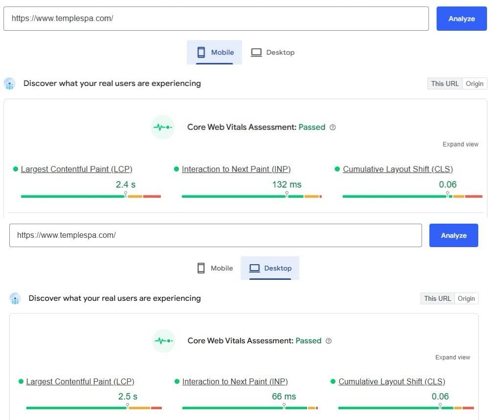
The TEMPLESPA case study illustrates how technical reliability can become the limiting factor even when the rest of the shopping experience performs strongly. The brand already had clear premium positioning, intuitive navigation, and compelling product storytelling. Shoppers were reaching checkout with strong purchase intent, particularly on mobile.
However, transaction completion lagged behind demand. The constraint emerged within the checkout experience itself, where slow page responsiveness and inconsistent performance on mobile devices disrupted progression at the final stage of purchase.
To address this, On Tap rebuilt and optimised the front-end experience with a strong focus on speed, stability, and mobile usability. Page load times were significantly reduced, Core Web Vitals improved, and the checkout flow was streamlined to support smoother movement from entry to confirmation.
Within three months of launch, TEMPLESPA recorded:
-
An 18% increase in mobile conversion rate
-
Alongside a 65 per cent improvement in page load times.
The project’s impact on user experience and performance optimization was later recognized at the 2025 eCommerce Awards, where TEMPLESPA won Silver for Best B2C UX in eCommerce, with On Tap leading the performance and frontend transformation behind the project.

This example illustrates how technical performance at checkout can become the limiting factor in conversion, even when brand, product presentation, and upstream funnel performance are strong.
Brooklinen: Controlled checkout flow and UX discipline
Website: https://www.brooklinen.com
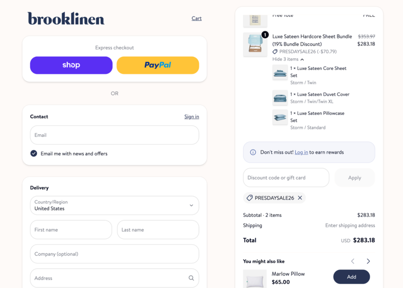
Brooklinen’s checkout demonstrates how clear progression and reduced input friction can protect momentum through the final stage of purchase.
Once checkout begins, the interface removes primary navigation and distractions, narrowing focus to the transaction itself. The layout follows a clean vertical progression, reducing visual fragmentation and guiding the user naturally toward completion. Required fields are limited to essential fulfillment and payment data, minimizing perceived effort.
Pricing clarity is maintained through a persistent order summary that updates as delivery details are entered. The final total does not introduce unexpected changes, reinforcing cost predictability before payment submission.
Payment options are presented clearly without overwhelming the interface. Express wallets are visible, yet structured in a way that preserves hierarchy and flow. Trust cues are subtle but present, reinforcing legitimacy without creating visual noise.
The result is a checkout experience that feels predictable and focused. That structural clarity protects transaction momentum and supports completion.
Conclusion
Checkout is the most concentrated point of revenue risk in the eCommerce funnel. While cart abandonment is inevitable, structural friction, pricing opacity, trust gaps, and technical instability are preventable.
Effective eCommerce checkout optimization requires more than isolated UX tweaks. It demands technical reliability, disciplined simplification, transparent pricing, aligned payment options, confidence reinforcement, and operational reliability.
At On Tap, our digital marketing services combine UX refinement, technical auditing, and data-driven experimentation to improve checkout completion and overall conversion performance. This expertise forms part of our eCommerce consultancy services, helping merchants strengthen checkout performance and overall conversion rates.
If you would like an expert assessment of your checkout flow or full conversion funnel, contact us now.
Checkout optimization FAQs
1. What checkout abandonment rate is considered high?
Industry benchmarks consistently place the average documented cart abandonment rate around 70%, with variation across devices and industries.
A “high” rate is relative to your own historical performance and segment. Rather than aiming for an abstract target, it’s more actionable to:
-
Compare checkout completion (checkout start → order complete) over time
-
Benchmark mobile vs desktop performance separately
-
Analyze stage-by-stage drop-off instead of only the aggregate rate
If your completion rate declines without a change in traffic intent, or if drop-off clusters sharply at a specific stage, that typically signals execution-related friction rather than demand limitations.
The objective is not to compare yourself to a generic benchmark, but to understand whether your checkout is converting the demand you are already generating as efficiently as it should.
2. Which checkout changes typically deliver the fastest impact?
The most immediate improvements usually address well-documented friction points: removing forced account creation, improving cost transparency, adding relevant digital wallets, or fixing payment errors.
Because these changes target high-intent users at the final stage, even small improvements can produce measurable increases in completed orders.
3. When should I focus on recovery instead of redesign?
Recovery strategies such as abandoned cart emails are most effective once structural friction has been minimized. They help capture residual demand but do not fix underlying checkout weaknesses.
If checkout abandonment is driven by preventable friction, redesign should come first. Recovery should complement optimization, not replace it.
4. How can I measure the success of my checkout optimization efforts?
Start by establishing a clear baseline before making any changes. Key metrics to monitor include:
-
Checkout completion rate (checkout start → order complete)
-
Step-level drop-off rates
-
Overall site conversion rate
-
Average order value
After implementing an optimization, compare performance against that baseline over a meaningful time period, accounting for traffic fluctuations and device mix. Whenever possible, use controlled testing. A/B testing helps isolate the impact of structural changes and reduces the risk of misattributing results to seasonality, campaigns, or traffic shifts.
Look beyond revenue alone. Improvements in step-level completion, reduced drop-off at specific transition points, and fewer checkout-related support issues are stronger indicators of meaningful progress.
Finally, avoid changing multiple major elements at once. Controlled iteration ensures you can confidently tie performance changes to specific optimizations rather than external variables.