On average, Shopify stores see conversion rates between 1.4% and 3.2%, but top-performing brands consistently outperform these benchmarks by optimizing every stage of the buyer journey. That’s where conversion rate optimization (CRO) comes in - helping you turn more visits into revenue without relying on constant acquisition.
This article provides a strategic, actionable framework for improving your Shopify store's conversion rates. You will learn:
-
How to systematically diagnose low or declining conversion performance using funnel metrics and behavioural data.
-
Practical tactics and best practices to increase your Shopify store’s conversion rate, illustrated with real-world Shopify case studies and measurable outcomes.
Why your Shopify store is losing conversions
When conversion performance issues appear, they tend to follow two patterns:
-
Some stores consistently underperform, never. converting traffic at the rates they should.
-
Others experience sudden drops in conversion rates, often without obvious changes in traffic volume.
Diagnosing underperformance at each stage of the buying journey
If your Shopify store has never converted traffic effectively, the problem is usually structural. These issues tend to show up at specific stages of the conversion funnel (Discovery → Product engagement → Add to cart → Checkout), and they persist until the underlying friction is resolved.
-
High bounce rate on product pages
-
Low add-to-cart rate on product pages
-
Low cart-to-checkout progression rate
-
High checkout abandonment rate
What if your conversion rate suddenly drops?
Your Shopify store has been performing steadily, with consistent traffic, reliable sales, and no major changes. But then, over a few days, your conversion rate starts to decline. There's no immediate red flag, but performance has shifted. In most cases, the cause falls into one of five areas:
1. Traffic quality
If your conversion rate drops but traffic volume remains stable or increases, start by investigating where the traffic is coming from and how it’s behaving.
Ask:
-
Have we launched a new campaign or changed our targeting?
-
Did we shift platforms (e.g., from Google to Meta ads)?
-
Is there a spike from a referral site, influencer, or email blast?
2. Technical performance issues
If users are abandoning product or collection pages quickly, especially on mobile, or if you're hearing complaints that the site feels “slow,” check performance immediately.
This typically results from recent modifications that slow down page rendering. Typical examples include:
-
Theme edits introducing render-blocking scripts
-
Uncompressed image/video uploads
-
App installs that slow down page load or inject third-party scripts
3. Functional errors
If users are adding items to the cart but dropping off before checkout, and there’s no obvious UX issue, you might be facing a silent functionality break, especially if changes were recently made to your theme or apps.
Typical culprits:
-
JavaScript errors are breaking the add-to-cart or cart updates
-
Conflicts between apps (especially upsell, bundle, or discount logic)
-
Checkout customizations causing validation failures
4. Operational changes
If your site is working technically good but conversion has dropped after a business-side update, consider whether your own rules are unintentionally discouraging purchases.
Examples include:
-
Changes to shipping rates or methods (e.g., removing local options)
-
Updates to discount logic (e.g., exclusions applied to high-converting products)
-
Out-of-stock or hidden products due to inventory syncing or tagging rules
-
Changes in payment methods or availability per region
5. External market factors
Sometimes, everything in your store is technically fine, but buyers are simply less inclined to purchase due to external factors such as:
-
Seasonality, such as lower intent after major sales events like Black Friday
-
Competitor activity, including undercut pricing or aggressive promotions
-
Macroeconomic pressure, like inflation, consumer uncertainty, or major events
-
Shifting demand, due to trend cycles or market saturation in your category
In the following section, we’ll walk through practical strategies and proven tactics to help you increase your Shopify conversion rate and build resilience against future drops.
7 Shopify conversion rate optimization strategies to boost sales
Boost Shopify store speed to reduce bounce and increase sale
Page speed has a direct impact on abandonment and conversion. According to Potent, a site that loads in 1 second converts 3x better than one that takes 5 seconds. This highlights just how much even small delays can impact revenue. The following tactics outline how you can improve performance on Shopify without sacrificing functionality or design.
-
Adopt lightweight media and design choices: Large, unoptimized media is one of the most common causes of slow page loads on Shopify, especially on collection and product pages, where multiple images and rich content load at once.
To mitigate this, use compressed Webp images, lazy loading, and defer non-critical elements like embedded videos. Avoid autoplaying media, particularly on mobile, where bandwidth and processor limits amplify the impact.
While implementation may require collaboration with your theme developer, the strategic decision lies in approving media standards and enforcing content guidelines that balance aesthetics and performance.
-
Streamline third-party app usage to reduce load strain: Shopify’s app ecosystem is one of its greatest strengths, but it’s also a common source of performance drag. Each installed app may add scripts, stylesheets, or tracking code that slows down page rendering. Regularly audit your installed apps to evaluate both their revenue contribution and impact on site performance. Remove any that are underperforming or redundant, and replace multiple single-purpose apps with streamlined solutions that combine key features to reduce load strain.
-
Use responsive Shopify themes optimized for fast speed and performance: Choose a fast, responsive theme built for Shopify’s Online Store 2.0 or work with a developer to build one that suits your brand without slowing your site. Clean code and minimal bloat form the foundation for all other performance improvements.
-
Minify and combine front-end assets: Ask your developer to reduce and consolidate your store’s CSS, JavaScript, and HTML files. This lowers the number of requests and shortens load time, helping pages appear faster for shoppers.
-
Ensure static assets are cached for returning visitors: Review how your theme and apps load images, fonts, and scripts. Shopify’s CDN caches core assets, but custom or third-party content may need proper cache headers to avoid reloading on every visit. This improves speed for repeat users, especially on mobile.
Shopify case study illustrating how optimising speed can lead to a better conversion rate
The Shopify store Sunday Citizen demonstrated the impact of speed-focused optimization by improving image performance and simplifying the layout. As a result, they saw:
-
a 25% improvement in Largest Contentful Paint (LCP),
-
a 61% improvement in Cumulative Layout Shift (CLS),
-
a 4% reduction in bounce rate, and
-
a 6% increase in conversion rates.
This case shows that performance isn’t just a technical issue. It’s a driver of commercial results. Optimising for speed improves the shopper experience and directly increases the chances they’ll complete a purchase.
For deeper guidance on improving store speed and shopper experience, read our article: Proven best practices for faster load times for Shopify speed optimization.
Streamline checkout process to increase completion rates
The checkout process is one of the most sensitive stages in the buyer journey, and a leading source of drop-off across both B2B and B2C transactions. While Shopify’s checkout is highly optimized by default, even small improvements to clarity, speed, and reassurance can yield meaningful gains in completion rates.
Reduce checkout steps to minimise friction and abandonment
Checkout is one of the highest-risk points in the purchase journey — and every extra step or form field increases the chance of drop-off. Streamlining the process helps reduce hesitation, improve load times, and boost conversion.
-
Use Shopify’s one-page checkout: Shopify’s standard checkout is already optimised for speed, but Shopify Plus users can now access a one-page checkout that combines shipping, payment, and order summary in a single view - reducing clicks and perceived effort.
-
Adapt the flow to match user expectations: For B2B, regulated, or high-AOV purchases where multiple steps may be required, reduce friction by grouping related steps. For example, combine the shipping address and delivery method on a single page instead of splitting them across separate screens.
Show a full cost breakdown before the payment step
Unexpected costs at the final stage are among the most common causes of cart abandonment. According to Baymard Institute, 39% of U.S. online shoppers have abandoned a purchase due to extra costs being too high (e.g., shipping, tax, fees), and 14% have done so because they couldn't see or calculate the total order cost upfront.
-
Display total cost clearly before users enter payment details: Show itemised pricing, estimated shipping, taxes, and discounts upfront — Shopify’s native checkout enables this on the order summary panel. Make sure this section is not collapsed by default, especially on mobile.
-
Use cart drawers or dynamic carts to preview totals: Implement a cart drawer or slide-out cart that updates subtotals instantly as users add or remove items. This is especially important for stores using automatic discounts, free shipping thresholds, or tiered pricing. Shopify’s AJAX cart or apps like Rebuy or Slide Cart Drawer can support this functionality.
-
Highlight promotions or savings next to the final price: Reinforce value by showing savings from bundles, discount codes, or loyalty points — this increases perceived fairness and encourages completion.
Reinforce trust at checkout with visual reassurance cues
Even small trust issues can cause high-intent shoppers to abandon checkout. Clear, well-placed reassurance signals can help remove hesitation and improve completion rates.
-
Use SSL and secure language: Display “Secure checkout” messaging and security icons near the payment form. These visual cues remind customers that their data is protected, especially important for first-time buyers.
-
Add a clear progress indicator: Show shoppers where they are in the checkout process (e.g., Shipping → Payment → Review). This reduces uncertainty and makes the process feel faster and more manageable.
Frictionless checkout in action: Lessons from Stellar Eats
Stellar Eats, a Canadian health food brand, tackled cart abandonment by switching to Shopify’s one-page checkout, simplifying the entire process and reducing friction.
Stellar Eats’ checkout illustrates several of these key optimizations in practice:
-
One-page layout brings together contact info, delivery, payment, and order summary in a single view, minimizing steps and load times.
-
Express checkout options like Shop Pay and Google Pay are clearly available at the top of the form, enabling faster checkout for returning users.
-
Autofill and “remember me” options reduce typing effort, especially on mobile.
-
The order summary panel shows products, pricing, and discount entry upfront, helping prevent surprise costs.
-
Security messaging like “Secure and encrypted” adds trust at the payment step.
As a result, Stellar Eats saw:
-
a 3.5% increase in conversion rate, and
-
a projected revenue boost in the tens of thousands of dollars over the following 24 months.
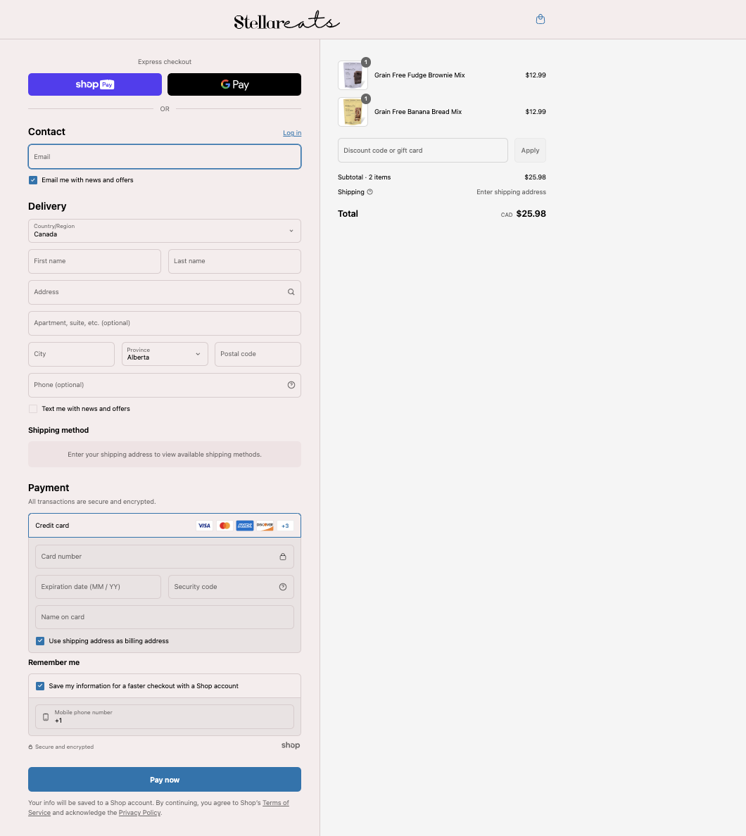
Stellar Eats’ results highlight how simplifying the checkout flow can convert more carts into completed orders and generate lasting business impact.
Recover abandoned carts and lost purchase intent
Not every shopper converts on their first visit, even with high purchase intent. Cart abandonments are common across eCommerce stores, but they’re also recoverable. By identifying where users exit and re-engaging them with timely, relevant interventions, you can turn missed opportunities into regained revenue.
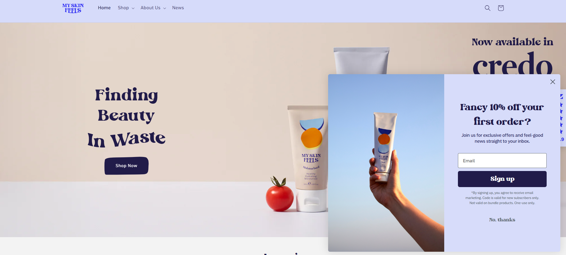
Use exit-intent pop-ups to re-engage high-exit users
Exit-intent pop-ups help recover drop-offs by intercepting users at the moment of hesitation. When a shopper moves to close the tab or switch apps, tools like Privy or Justuno can trigger a targeted message based on cursor or browser behavior. You can configure these prompts to offer a low-risk incentive, such as free shipping or a time-limited bonus.
For example, when a visitor moves to leave, My Skin Feels triggers a clean, well-timed pop-up offering 10% off in exchange for an email. This simple incentive re-engages users at the moment of hesitation and reduces bounce. It’s a strong example of using exit-intent logic to drive list growth and recover potential lost sales.
Offer real-time support to reduce last-mile hesitation
Cart abandonment often results from unanswered questions about product specs, delivery, or returns. Shopify Inbox enables live chat prompts to appear based on cart activity or time on site.
For example, if a user spends more than 45 seconds viewing the cart without progressing, a prompt like “Need help with shipping or returns?” can appear. This creates a support window right at the moment of hesitation, especially useful for higher-value baskets or first-time visitors.
Send abandoned cart emails with targeted reminders
Shoppers who abandon the checkout have already signalled high purchase intent, making them one of the most valuable audiences to re-engage. A well-structured cart recovery email program can reclaim up to 15% of that lost revenue, often at a lower cost than acquiring new customers.
To be effective, cart emails must be relevant and timely. Cart recovery emails should dynamically reflect what the customer left behind — including product names, images, pricing, and a direct link to resume checkout. Messaging should adapt to user type: first-time buyers may need reassurance about returns or delivery, while returning customers may respond better to urgency or loyalty-based nudges.
Once content is aligned, timing becomes critical. The first reminder should be sent within 1–2 hours to capitalise on fresh intent, with follow-ups over the next 24–48 hours based on cart size and engagement level.
American Giant, a Shopify-powered apparel brand, uses this approach with a clean, product-specific recovery email. The message includes:
-
A reminder headline: “See something you like?”
-
A personal nudge: acknowledging the shopper viewed an item but didn’t check out
-
A direct link to return and purchase
-
The product left behind, clearly shown with image, title, and price
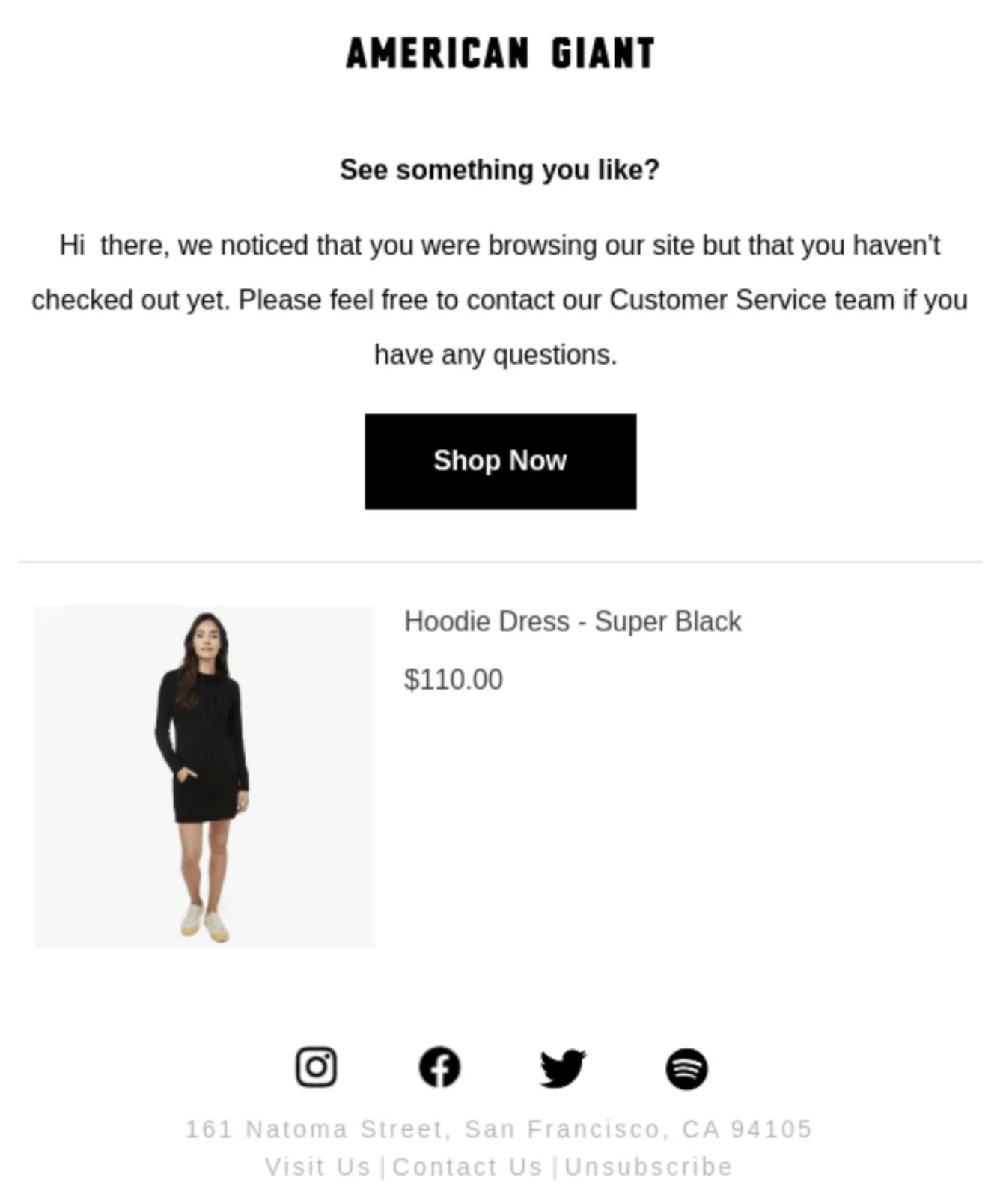
This format minimizes friction and provides a simple, relevant path back to checkout — a key reason cart recovery emails remain one of the most cost-effective retention tools on Shopify.
Optimize product pages to convert interest into action
Product pages are where browsing turns into decision-making. The following tactics focus on practical improvements that increase engagement and purchase rates without relying solely on discounts or promotions.
-
Lead with benefit-focused copy, not just technical specs: Before listing product details, clarify how the item solves a specific problem or delivers value. Whether your customer is buying for personal use or business needs, highlighting the outcome (like improved performance, time savings, or cost efficiency) helps them quickly understand why the product is worth considering. Specifications still matter, but benefits give them meaning.
-
Use zoomable, contextual visuals and 360° views: Offer high-quality images that users can zoom into, plus contextual or lifestyle photography that shows the product in real-life use. For high-consideration items (e.g., electronics or furniture), add 360° or AR/3D views using Shopify’s media support to reduce doubt and returns.
-
Make CTAs large, thumb-friendly, and value-driven: Your Add to Cart button should be highly visible, easy to tap on mobile, and placed above the fold. Use clear, benefit-oriented text that reflects user intent (e.g., “Add to Bag – Free Returns” or “Get Yours Now”). Avoid cluttered layouts, secondary CTAs, or visual distractions that compete with the primary action.
-
Optimize mobile product pages for scannability and fast action: Mobile users scroll quickly and make decisions faster. Keep key actions - like the Add to Cart button - visible early, and format content using collapsible sections, bullets, and short blocks. This improves clarity and keeps high-intent shoppers moving forward.
-
Use social proof like reviews, UGC, and star ratings: Place ratings and review counts near the product title or price so users see them before they scroll. Highlight specific quotes, verified buyer badges, or user-generated content like photos and videos. According to ConvertCart, UGC can increase conversion rates by up to 28%.
Allbirds, a sustainability-focused brand on Shopify Plus, exemplifies best-practice product page design:
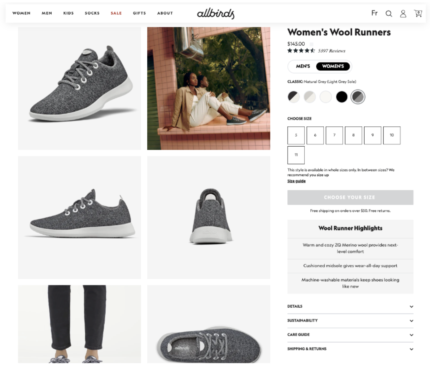
-
Their pages open with benefit-led copy (“Light on your feet. Easy on the planet.”), engaging users with brand and product value before detailing specs.
-
They use zoomable, high-quality images and contextual visuals showing the product in real life, which helps reduce hesitation.
-
Key trust signals like customer reviews, sustainability credentials, and clear return policies are placed close to the Add to Cart button.
-
On mobile, Allbirds prioritizes speed and scannability - CTAs, product benefits, and reviews all appear early in the scroll to support fast decision-making.
Launched in 2016, Allbirds reached a $1.4 billion valuation in under two years, making it one of Shopify’s most iconic DTC success stories. Their product page performance is no coincidence: it's a result of deliberate, user-focused design that removes friction and reinforces brand trust. For any high-growth brand, Allbirds’ approach offers a proven template worth learning from.
For more examples and in-depth tactics, read our article: Shopify product page optimization: 11 proven tactics to boost sales.
Improve site search and store navigation to support product discovery
According to Retail News and Trends, 41.2% of online shoppers are most turned off by a poorly designed menu, followed by 29.8% due to basic search capabilities, and 26.4% when products are buried behind excessive branding. The tactics below help you evaluate and optimize store structure to reduce friction and support decision-making at every stage of the journey.
Add filters and sorting tools to collection pages
When shoppers land on a collection page, they’re often exploring with a loose intent, such as finding something in their size, preferred colour, or within a certain price range. Effective filtering and sorting tools help them quickly narrow results and reduce friction on the path to purchase.
-
Enable filters based on attributes like size, colour, and availability: Use Shopify’s native filtering system (or the Search & Discovery app) to show relevant filters that match your catalogue. Always prioritize the most common decision criteria.
-
Enable filters within search results: Filtering helps users narrow large catalogues and is essential for high-SKU stores like fashion, electronics, or B2B. Make sure users can refine search results by price, size, brand, or category. Shopify Online Store 2.0 supports basic filtering, but apps like Boost Product Filter & Search offer more robust faceted search.
-
Add sort options to help users reorder the collection: Let users sort by price, popularity, or newest first. These controls give shoppers more agency over how they browse, especially helpful in large catalogues where endless scrolling becomes a barrier.
-
Optimize for mobile usability: Ensure filter and sort controls are mobile-friendly — use collapsible or slide-out panels with large, tap-friendly inputs. Avoid requiring multiple taps to apply a filter, and ensure that applied filters are clearly visible and easy to clear. A well-designed mobile filter experience prevents user drop-off during exploration.
Use breadcrumb navigation to help users backtrack easily
When users arrive from search or ads, they often land deep within your store, like on a product or sub-collection page.
Show a simple, clickable path like “Home > Furniture > Office Chairs” near the top of relevant pages - including product, collection, blog, and search result pages.
These breadcrumbs help users understand where they are within your store’s structure and give them a clear way to move backwards without restarting their journey.
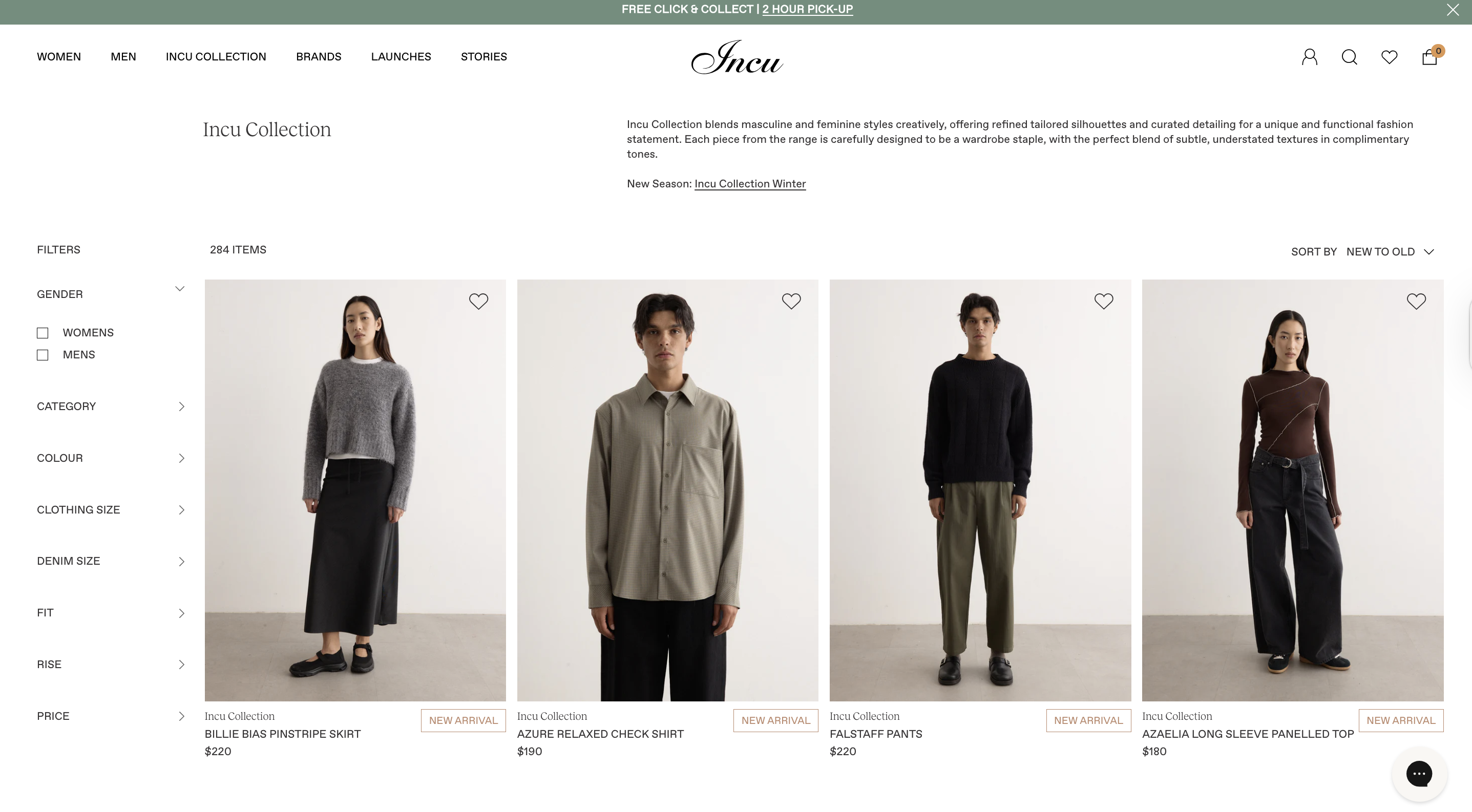
Navigation done right: Lessons from a Shopify store
Incu, an Australian fashion retailer, faced the challenge of managing a large, multi-brand catalogue across its online store.
To make product discovery easier, they implemented advanced filtering options that allow shoppers to narrow collections by attributes like brand, size, and style. By reducing the time and effort needed to find relevant products and making browsing more intuitive, Incu achieved:
-
a 15% increase in conversion rate within the first week,
-
a 26% growth in revenue, and
-
a 40% reduction in bounce rate.
Design mobile navigation around real user behaviour, not just a smaller version of desktop
Most Shopify traffic comes from mobile, accounting for nearly 70% of all eCommerce traffic in the U.S. as of 2024, according to Statista. To reduce friction, your mobile navigation should be designed around how users browse on mobile, not simply adapted from the desktop version in a smaller format.
-
Prioritize high-intent links in the first tap: Use your hamburger menu strategically. Most Shopify 2.0 themes include a mobile-friendly hamburger menu by default. If yours doesn’t, switch to a 2.0 theme or ask your developer to add one via the
header.liquidfile.Once enabled, place links like “Bestsellers,” “New Arrivals,” “Track Order,” and “Gift Cards” in the top level of the menu, not buried in submenus.
-
Minimize nested submenus: Avoid deep menu structures like “Women → Clothing → Tops → Sleeveless.” These require too many taps and lead to drop-offs. Flatten your navigation where possible, surfacing key collections in one or two levels max.
-
Keep it thumb-friendly and goal-oriented: Use large, tappable links with clear labels. Remove or deprioritise low-conversion links like blog posts or job pages. Focus the menu on what drives sales - product categories, delivery info, current promotions, and help.
For a more comprehensive guide to improving mobile performance and navigation across your Shopify store, see our full article on Shopify mobile optimization.
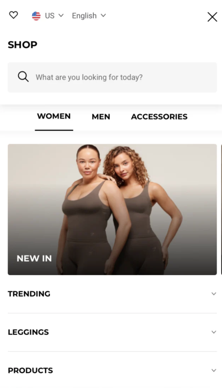
Gymshark’s mobile menu shows how to do it right: It surfaces high-converting links like deals and new arrivals immediately after tap, uses a familiar top-left hamburger icon, and offers a clean, intuitive layout that minimizes friction, making it easy for users to start shopping with minimal effort.
Incu’s success shows how improving store navigation, particularly through faster filtering and simpler browsing paths, can directly boost product discovery and drive commercial gains.
Use incentives strategically to drive action
Incentives are most effective when they do more than just drive short-term sales - they should reinforce your brand promise and motivate the right behaviours. Whether you're encouraging first-time purchases, referrals, or long-term loyalty, strategic use of incentives can increase conversion, boost retention, and create deeper customer alignment.
Trigger first-time incentives to convert new visitors
New visitors are more likely to hesitate at checkout, especially without prior brand familiarity. Offering a clear incentive early in their session can increase first-order conversion without relying on deep discounting.
-
Lower the barrier to first purchase with simple, time-bound incentives: Use targeted popups, banners, or post-signup flows to offer new customers a benefit — such as 10% off, free shipping, or a free gift.
-
Prioritize value exchange incentives over blanket discounts: Tie the offer to an action, such as joining your email or SMS list. This preserves margin while growing your retention channels, turning first-time conversions into longer-term revenue.
-
Align incentive format with brand positioning: For premium or niche brands, alternative incentives (like free samples, exclusive access, or loyalty points) can drive conversion without discounting the perceived value of the product.
Launch referral programs to drive high-ROI growth through existing customers
Referral programmes are a cost-efficient acquisition lever that turns customer satisfaction into measurable growth. Referred customers are 4x more likely to convert and have higher LTV than average new customers. A well-structured referral scheme can offset rising performance marketing costs.
-
Choose a referral model aligned with your brand and margin structure: For premium or high-AOV products, offer exclusive gifts or store credit rather than discounts. For volume-driven models, dual-sided offers (e.g. £10 for you, £10 for your friend) tend to scale faster.
-
Segment and target your highest-value customers first: Referral effectiveness isn’t evenly distributed. Focus on incentivising customers with high purchase frequency or strong NPS scores—they’re more likely to refer and bring in similar high-LTV buyers. Tools like Klaviyo or Shopify Audiences can support this segmentation.
-
Integrate referrals into existing post-purchase journeys: Avoid launching a standalone programme that requires extra effort to discover or engage with. Embed referral prompts in key lifecycle touchpoints (like order confirmation pages, loyalty dashboards, or account areas) so participation feels seamless.
Build loyalty programmes that drive repeat purchases and deepen customer value
Loyalty programs are most effective when aligned with your business model and margin structure. When done right, they increase order frequency, average order value, and brand stickiness — without constant discounting.
-
Points-based rewards for frequent purchases: Best suited to high-repeat categories like beauty, supplements, pet care, or groceries. Offer 1–3% of order value back in points, with a minimum redemption threshold (e.g. 500 points = £5) to maintain profitability. Award points not only for purchases but also for high-value actions like writing reviews, referring friends, or subscribing to emails. This builds engagement between purchases and encourages habit formation.
-
Tiered programs for long-term retention: Ideal for high-AOV or slower-purchase-cycle industries like fashion, home, or wellness. Use levels like Bronze, Silver, and Gold to reward continued engagement with perks such as early access, priority shipping, or exclusive products. This incentivises customers to stay active and build value over time.
-
Non-monetary perks that deepen brand affinity: For premium or mission-driven brands where pricing integrity and brand equity are key, loyalty should reinforce identity, not undercut value. Instead of discounts, offer member-only drops, surprise gifts, or access to private content and events. These experiences build emotional connection and brand advocacy.
Incentives with impact: How Paceline turned movement into motivation
Paceline originally rewarded users’ healthy habits with gift cards, but the approach lacked relevance to their wellness-focused audience and created operational inefficiencies.
To address this, Paceline partnered with over 150 health and wellness brands through Shopify Collective, replacing gift cards with curated products like supplements, fitness gear, and healthy snacks. This shift made incentives more meaningful to users, aligned closely with their values, and streamlined fulfilment by leveraging Shopify’s infrastructure.
By realigning their incentive strategy, Paceline achieved:
-
262% increase in Year-over-Year Sales: Boosted by the expanded and relevant product catalogue.
-
185% growth in customer acquisition: Attracted by the curated wellness offerings.
-
90% reduction in support requests: Simplified reward redemption process enhanced user satisfaction.
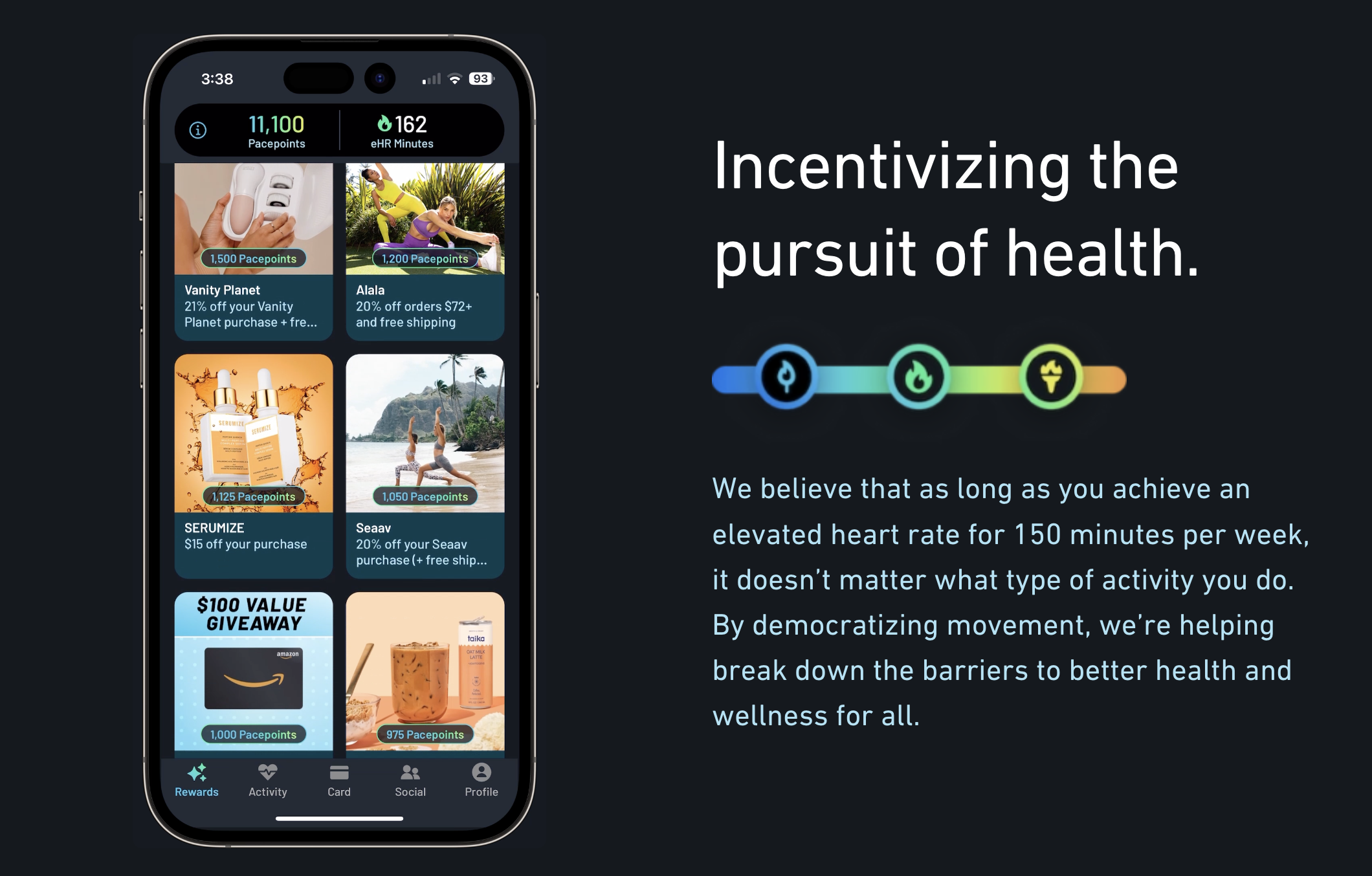
By replacing generic gift cards with relevant, wellness-focused products, Paceline demonstrated that strategic incentives don’t just reward behaviour—they strengthen brand alignment, increase repeat engagement, and drive sustained revenue growth.
Personalize experience based on behaviour and context
Personalization directly impacts both customer loyalty and revenue. According to Shopify, 57% of consumers are willing to spend more with brands that offer tailored shopping experiences. This means using behavioural data, such as browsing activity or past purchases, to shape what each customer sees.
Trigger on-site prompts in response to real-time user behaviour
Shoppers often hesitate due to uncertainty, especially when considering higher-value or unfamiliar products. Timely, behaviour-based prompts can reduce abandonment by offering reassurance or incentives when they’re most likely to make a difference.
Use triggers like time on page, scroll depth, or cart value to detect when users are stalling. Then match the message to their intent. For example, if a user scrolls halfway through a product page but doesn’t interact after 30 seconds, show a prompt highlighting customer reviews or your return policy to build confidence.
In Shopify, this can be done using apps like Justuno or Privy, which support session-based logic, or through custom Liquid conditions in your theme for simple prompts.
Personalize homepage content, banners, or offers based on traffic source or cart status
Visitors who arrive at your store via different channels often have different expectations. A user coming from a paid ad for a specific product should see that product featured immediately, not a generic homepage. Similarly, a referral from a partner site may warrant unique messaging or an exclusive offer.
Shopify stores can implement this using URL parameter logic, metafields, and dynamic content in Liquid templates. This tactic helps reduce bounce rate and ensures the content aligns with acquisition intent.
Retarget returning users with personalized content based on past engagement
Returning visitors are among the highest-converting segments — they’ve already shown intent. Personalized content reconnects them to their previous journey, reduces friction, and increases the likelihood they’ll complete a purchase.
Shopify enables you to identify known visitors and dynamically surface relevant content tied to their behaviour. For example, a user who spent time browsing a specific category can see that category promoted on the homepage, or one who previously downloaded a size guide can be shown product recommendations within that range. Loyalty members can be reminded of their points status or shown content tailored to their tier.
These subtle adjustments help reconnect users with their browsing intent and create a sense of continuity that encourages re-engagement.
Personalization in action: How Pura Vida Bracelets turned relevance into results
Pura Vida Bracelets faced a common challenge: how to scale product discovery and improve engagement across a broad catalog without overwhelming shoppers. With thousands of SKUs and a highly visual brand, static merchandising alone couldn’t deliver the relevance their audience expected.
To solve this, they implemented Nosto on Shopify to personalize product recommendations based on individual browsing behavior and site-wide trends. By displaying dynamic modules like “You May Also Like” and “Trending Now” on product and homepage views, they created a more tailored shopping experience for each visitor.
As a result, Pura Vida achieved:
-
14x return on investment from their personalization strategy
-
5.7% conversion rate on product pages, driven by relevant cross-sells
-
9.7% homepage click-through rate, powered by dynamic recommendations
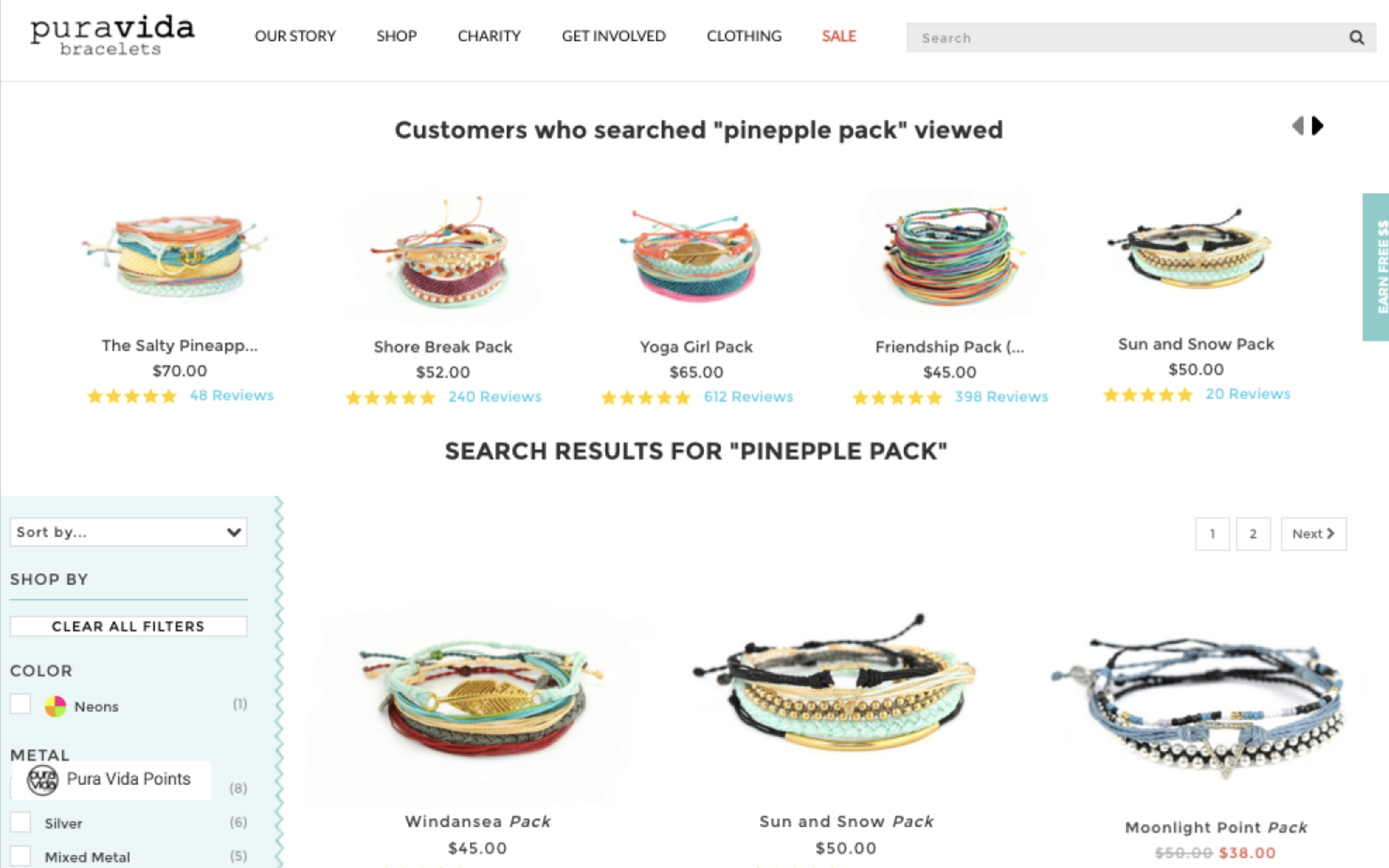
Pura Vida’s success illustrates the broader value of personalization: when on-site experiences reflect each shopper’s behavior and context, brands don’t just guide customers more effectively — they build trust, increase engagement, and grow revenue sustainably.
Shopify CRO advanced tips you shouldn't miss
Run A/B tests on layouts, CTAs, copy, and navigation to validate ideas
A/B testing allows you to make evidence-based decisions by comparing variations of messaging, layout, or user flow to see which version performs better. This is especially useful for uncovering what drives action in different customer segments.
For instance, a B2C store might test whether highlighting “next-day delivery” or “limited stock remaining” on product pages leads to more add-to-cart actions. A B2B store, on the other hand, might compare how offering tiered pricing versus gated pricing affects quote requests or sign-up completions.
Focus on traffic quality as the foundation of conversion rate optimization strategies for Shopify
Conversion rate optimization only works when the right visitors come to your store. If site behaviour metrics (like bounce rate or time on page) look stable but conversions remain low, the issue is often poor traffic quality — large volumes of low-intent visitors that inflate sessions but rarely purchase.
-
Refine ad targeting and messaging: Start by reviewing your recent campaigns. Are your ads being shown to users who match your ideal customer profile, based on demographics, interests, or purchase behaviour? Once targeting is accurate, make sure your messaging reflects your product’s positioning. For example, using generic “Big Sale” language to promote a premium brand can attract discount seekers who have no intent to buy.
-
Match each campaign to a landing page that reflects its promise: If an ad promotes “Sustainable Essentials Under £50,” it should link to a filtered page showing only those products, not a general collection. Avoid sending traffic to broad destinations like the homepage unless the offer applies storewide. Even small mismatches between ad messaging and landing content drive bounce and lost intent.
Treat conversion rate optimization as an ongoing process
Conversion rate optimization should be seen as a continuous cycle, not a one-off project. Customer behavior, technology, and market dynamics change constantly — meaning tactics that work today may underperform tomorrow.
The best approach is to embed Shopify conversion rate optimization into your regular business operations: track performance metrics, run experiments, analyze results, and refine. By making small, ongoing improvements rather than relying on a single large overhaul, you build a store that adapts over time and consistently maximizes conversions.
Conclusion
This Shopify conversion rate optimization guide covered proven tactics across the full journey: boosting site speed, fixing traffic quality issues, simplifying navigation, optimizing product pages, personalizing experiences, streamlining checkout, and recovering abandoned carts. Each one was backed by Shopify-specific examples and practical implementation advice.
But long-term gains don’t come from isolated tactics - they rely on building a structured, test-driven optimization process. That’s why we outlined how to embed CRO into daily operations: using behavioral data to identify issues, validating changes through testing, and safeguarding performance with ongoing QA and real-time monitoring.
The strategies in this article will help you make immediate improvements, but they are only part of the picture.
To explore the deeper reasons why Shopify stores lose conversions and learn additional strategies to address them, download our full guide. It includes practical implementation advice and real-world Shopify examples to help you apply these tactics with confidence.
You can learn more and download the guide here: [Download the Complete CRO Playbook for Shopify Brands]
As a Shopify conversion optimization expert, On Tap works with growth-focused Shopify brands to turn these principles into measurable outcomes.
Ready to strengthen your Shopify store’s conversion performance? Talk to On Tap - We’ll help you identify what's holding back conversion, implement changes with confidence, and build a more resilient Shopify conversion rate optimization strategies across your store.
FAQs
1. What is Shopify conversion rate optimization?
Shopify CRO is the process of systematically improving your store to turn more visitors into customers by reducing friction and increasing purchase intent at every stage of the journey.
2. What is a good Shopify conversion rate?
A “good” eCommerce conversion rate is highly context-dependent. While global averages typically fall between 2% and 3%, performance varies significantly based on factors such as industry, price point, device mix, and traffic source.
3. How to increase conversion rate on Shopify?
To increase your Shopify conversion rate, focus on optimising key conversion drivers across your store:
-
Boost site speed to reduce bounce and keep high-intent users engaged
-
Improve navigation to help shoppers find products quickly and intuitively
-
Optimise product pages to turn interest into purchase decisions
-
Streamline checkout to reduce friction and increase completion rates
-
Use incentives strategically to encourage action without eroding margin
-
Personalise the experience based on user behaviour and context
-
Recover abandoned carts to capture lost purchase intent
-
Continuously test and optimise using data, experiments, and customer insights