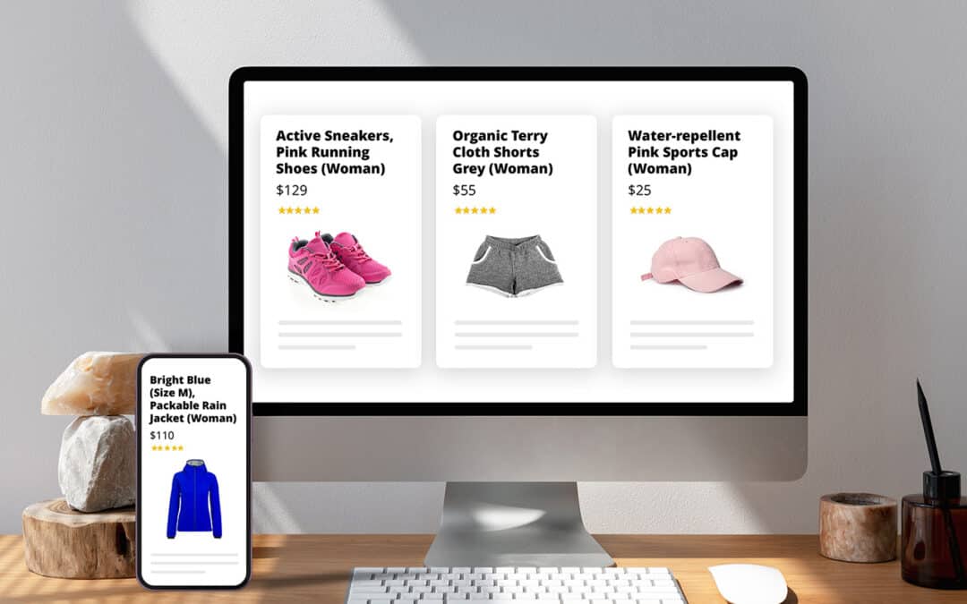
Product page optimization is the process of enhancing key elements on the product listing page — from content and visuals to pricing display, trust signals, and mobile experience — to help shoppers confidently evaluate the product and complete their purchase with minimal friction.
Your Shopify product page is where shoppers decide whether to buy or leave. Optimizing it with Shopify’s native tools, customizable Online Store 2.0 themes, and third-party apps can directly enhance user experience, increase conversion rates, and boost overall sales performance.
In this guide, we’ll break down 11 proven tactics, each mapped to a critical product page element, so you can focus on what drives measurable impact.
What matters most on a high-converting Shopify product page
Every Shopify product page plays a critical role in turning interest into intent. To convert effectively, the page must support how buyers evaluate relevance, compare alternatives, reduce risk, and take action — all within a few key interactions. The following 10 components represent the structural foundations of a high-converting product page across both B2C and B2B use cases.
1. Product information
What it entails:
-
Product title
-
Product description
-
Technical specifications (e.g., dimensions, materials, performance attributes)
-
Variant selectors (e.g., choose size, colour, or configuration)
-
Quantity pickers
-
Identifiers such as SKU, unit count, or stock availability
Why it matters:
Product information enables buyers to evaluate whether the product meets their specific needs — in terms of function, fit, and value. Titles signal relevance. Descriptions and specifications clarify what the product does and how it compares. If key details are missing or unclear, buyers hesitate, misjudge suitability, or abandon the page.
2. Visual presentation
What it entails:
-
Product images (main and variant-specific)
-
Lifestyle or contextual photos
-
Product videos, 360° views, or AR (augmented reality assets — 3D models that let shoppers view the product in their real-world environment via mobile)
Why it matters:
Shoppers rely on images and video to form first impressions and evaluate product quality. Visuals help them assess texture, dimensions, variant differences, or use-case context, especially when they can’t physically engage with the product.
3. Price and offer presentation
What it entails:
-
Final price display
-
Compare-at-pricing or sale indicators
-
Tiered or volume-based discounts
-
Urgency cues (e.g., low stock, countdown timers)
Why it matters:
Price is one of the first things shoppers look for. How pricing is presented — including discounts, volume incentives, or urgency signals — directly influences perceived value and purchase timing. Unclear pricing causes hesitation, while smart framing increases conversion and order value.
4. Call-to-action
What it entails:
-
Add to Cart, Buy Now, or Request a Quote button
-
Sticky or floating CTA on mobile
-
Button styling and placement logic
Why it matters:
The CTA is the key action point — it’s where the shopper decides to move forward, whether that means adding to the cart, buying now, or requesting a quote. If it’s hard to find, confusing, or visually weak, it disrupts momentum. Every moment of uncertainty at this stage reduces conversion and adds friction to the path to checkout.
5. Reassurance and trust signals
What it entails:
-
Customer reviews and star ratings
-
Return/exchange policies
-
Guarantees and trust badges
-
FAQs or product Q&A
Why it matters:
Trust signals reduce buyer anxiety, especially for new customers or unfamiliar brands. Reviews, guarantees, and clear return policies address common objections and help shoppers feel safe committing to a purchase — particularly for higher-priced or complex products.
6. Delivery, shipping & returns
What it entails:
-
Estimated delivery timelines
-
Shipping costs and thresholds
-
Lead times or pre-order/backorder messaging
-
Return/exchange conditions
Why it matters:
Buyers want clarity on logistics before making a commitment. Hidden shipping costs or vague timelines are common reasons for cart abandonment. Transparency around fulfillment builds trust and reduces the perceived risk of ordering, especially for new or international customers.
7. Product discovery & related items
What it entails:
-
Related product carousels (e.g., “You may also like”)
-
Complementary suggestions (e.g, “Complete the look”)
-
Bundled or “frequently bought together” sets
Why it matters:
Related product suggestions help buyers explore your catalog more efficiently. For B2C, they inspire ideas and increase basket size. For B2B, they streamline repeat or accessory-based purchasing. When well-targeted, these elements boost order value without distracting from the core purchase.
8. Product page layout & design
What it entails:
-
Section ordering and layout logic
-
Visual hierarchy and scannability
-
Branded layout variations by product type
-
Tab, accordion, or modular content formats
Why it matters:
The way content is structured — in terms of order, spacing, and emphasis — shapes how buyers process information. Good design guides the eye, reduces effort, and supports confidence. Poor layout creates confusion, makes key details harder to find, and weakens the overall experience.
9. Mobile experience & responsiveness
What it entails:
-
Responsive layouts for small screens
-
Tappable, well-spaced elements
-
Mobile-first content prioritization
-
Sticky elements that don’t obstruct navigation
Why it matters:
The mobile experience has a direct impact on conversions. As of 2024, mobile devices account for approximately 57% of global eCommerce sales, underscoring the importance of optimizing the mobile shopping experience (according to Capital One Shopping). Yet mobile UX is often an afterthought. On smaller screens, cramped layouts, slow load times, or inaccessible buttons quickly frustrate users. A mobile-optimized experience ensures that key content and actions are easy to engage with, directly impacting bounce rate, add-to-cart rate, and completion rate.
10. Performance and crawlability
What it entails:
-
Page speed and asset optimization
-
Mobile performance consistency
-
Structured data (schema.org markup)
-
SEO-friendly URLs and fully crawlable, indexable content
Why it matters:
If a product page loads slowly, performs poorly on mobile or isn’t indexed by search engines, it loses traffic before it has a chance to convert. Technical performance ensures the page is accessible, discoverable, and usable — all prerequisites for successful optimization.
Each of the tactics in the next section addresses one or more of these elements, giving you a practical roadmap to improve both conversion outcomes and long-term performance.
Proven tactics to increase Shopify product page conversions
With the key elements of your product page defined, the next step is to put them to work. The tactics that follow are practical, tested ways to turn those elements into high-converting assets. Each tactic is backed by real Shopify case studies, featuring leading brands across fashion, consumer electronics, and B2B — so you can apply them with confidence and clarity.
1. Write product descriptions that sell, not just inform
The product description is one of the most overlooked levers for increasing conversions on Shopify. While many stores use it to list specifications, high-performing merchants treat it as a structured sales pitch: one that speaks directly to the customer’s needs, anticipates objections, and builds confidence before the shopper reaches the cart.
Focus on benefits, not just features
Avoid listing only specifications or technical attributes. Instead, position the product as a solution to a specific need.
-
For B2C, this could mean highlighting comfort, ease of use, or personal style.
-
In B2B, focus on business impacts such as time savings, compliance, durability, or integration with existing systems.
Clear benefit-led descriptions reduce hesitation, support faster decisions, and differentiate your products in a crowded market.
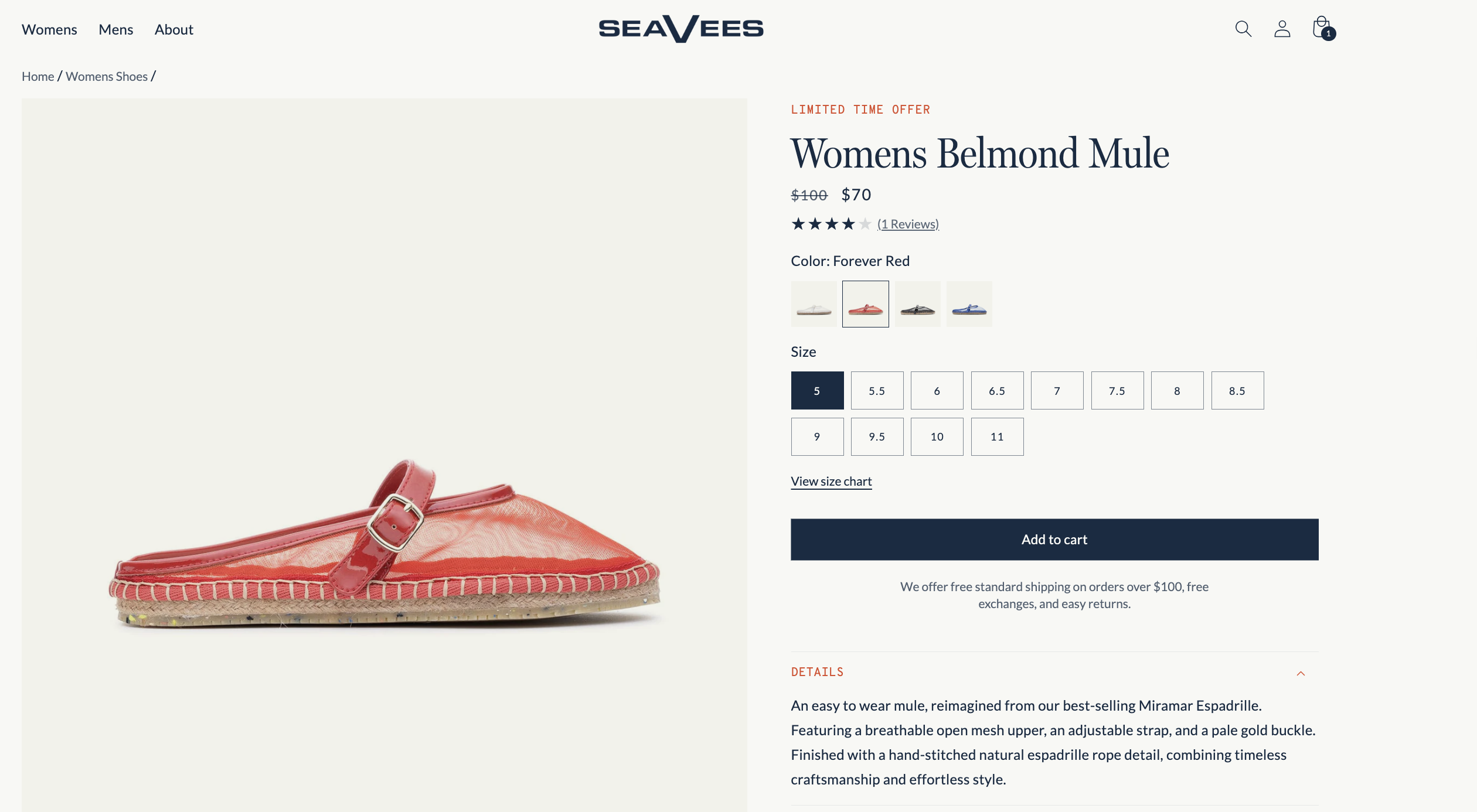
Case study: SeaVees
SeaVees revamped their product pages to go beyond specifications, using benefit-led messaging and real-world context. Rather than relying solely on specifications, their descriptions highlight material and construction benefits in a relatable tone. For example, the Belmond Mule is introduced as “an easy-to-wear mule, reimagined,” featuring a “breathable open mesh upper” and “hand-stitched natural espadrille rope detail.” This type of messaging conveys comfort, quality, and craftsmanship — helping shoppers picture the product in real-world use and reinforcing post-purchase satisfaction.
Personalise messaging using Shopify Metafields
Shopify Metafields are custom data fields that let you store and display product-specific information beyond the standard Shopify fields. On product pages, you can use Metafields to control which content appears based on attributes like variant, product type, material, or market — without creating separate product listings or hardcoding template changes.
Note: Metafields alone don’t trigger display changes — you’ll need to apply Liquid conditionals or use Shopify’s native dynamic source bindings.
You can use Metafields to personalize several types of content:
-
Fit or sizing guidance
B2C: Show different notes for “slim fit” vs “relaxed fit” items
B2B: Include measurement tolerances or unit compatibility for industrial products -
Material-specific benefits or care instructions: Display special care notes for delicate fabrics or cleaning requirements for technical gear
-
Use-case messaging
B2C: Add content like “Perfect for weekend travel” only on relevant products
B2B: Include messages like “Designed for cleanroom environments” based on product tags or variants -
Compliance or localization notes: Show region-specific warnings, regulatory approvals, or language variants.
Metafields are fully supported in Online Store 2.0 themes and are managed under Shopify Admin > Settings > Custom Data. Once defined, you can reference them in your theme using dynamic blocks or conditional logic to display content only when relevant.
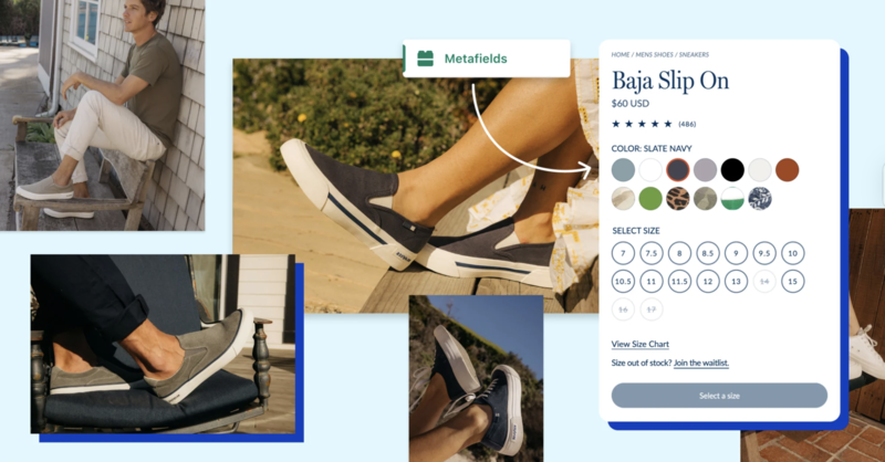
Case study: SeaVees (Metafields)
SeaVees uses Shopify Metafields to tailor content for each variant, including:
-
Variant-specific details like size advice or style origin
-
Conditional logic that displays relevant notes only when applicable (e.g., available colors, material tips)
This ensures each shopper sees only the most relevant information, increasing clarity without overwhelming the page.
2. Use high-quality visuals, lifestyle shots, and variant media to support buyer decisions
Shoppers rely on visual context to judge product suitability. Strong imagery can answer unspoken questions and reduce reliance on support or returns.
-
Show high-quality, zoomable images: Use sharp, high-resolution visuals — especially for premium or detailed products. Shopify’s default compression can reduce clarity, so upload WebP files and test image zoom on mobile and desktop. Apps like Magic Zoom Plus offer enhanced zoom without slowing your site.
-
Add multiple angles and close-ups: Include front, back, side and close-up shots to help shoppers inspect products as they would in-store. Shopify themes support image galleries and variant-specific views — use these to reduce doubt and returns.
-
Use lifestyle images to show real use: Display the product in context (e.g., being worn, used, or styled) to help customers visualize fit, size, and purpose. Add these as secondary images or use Shopify’s media blocks to blend them into the page layout for better engagement and higher conversion.
-
Link images to product variants: Ensure the main image updates when users select a different color, size, or style. Shopify supports this, but many stores underuse it. Proper image-to-variant mapping increases clarity and reduces hesitation, especially in apparel and accessories.
-
Use videos or motion-based media (e.g., GIFs): Short try-ons, demos, or 360° clips increase engagement and buyer confidence. Add videos directly to the product gallery or use apps like Vidjet or Product Video Gallery by POWR.
-
Add advanced media like 3D or AR (if relevant): For high-value products, support 3D or AR views using Shopify-compatible .glb or .usdz files in the product gallery. Ideal for tech, furniture, or premium categories.
Case study: Master & Dynamic
Premium audio brand Master & Dynamic uses high-quality visuals to support premium positioning and reduce buying hesitation.
Their product pages include:
-
Zoomable close-ups of materials and craftsmanship
-
Lifestyle shots showing scale and usage in context
-
Variant-specific images that update dynamically with selected colors
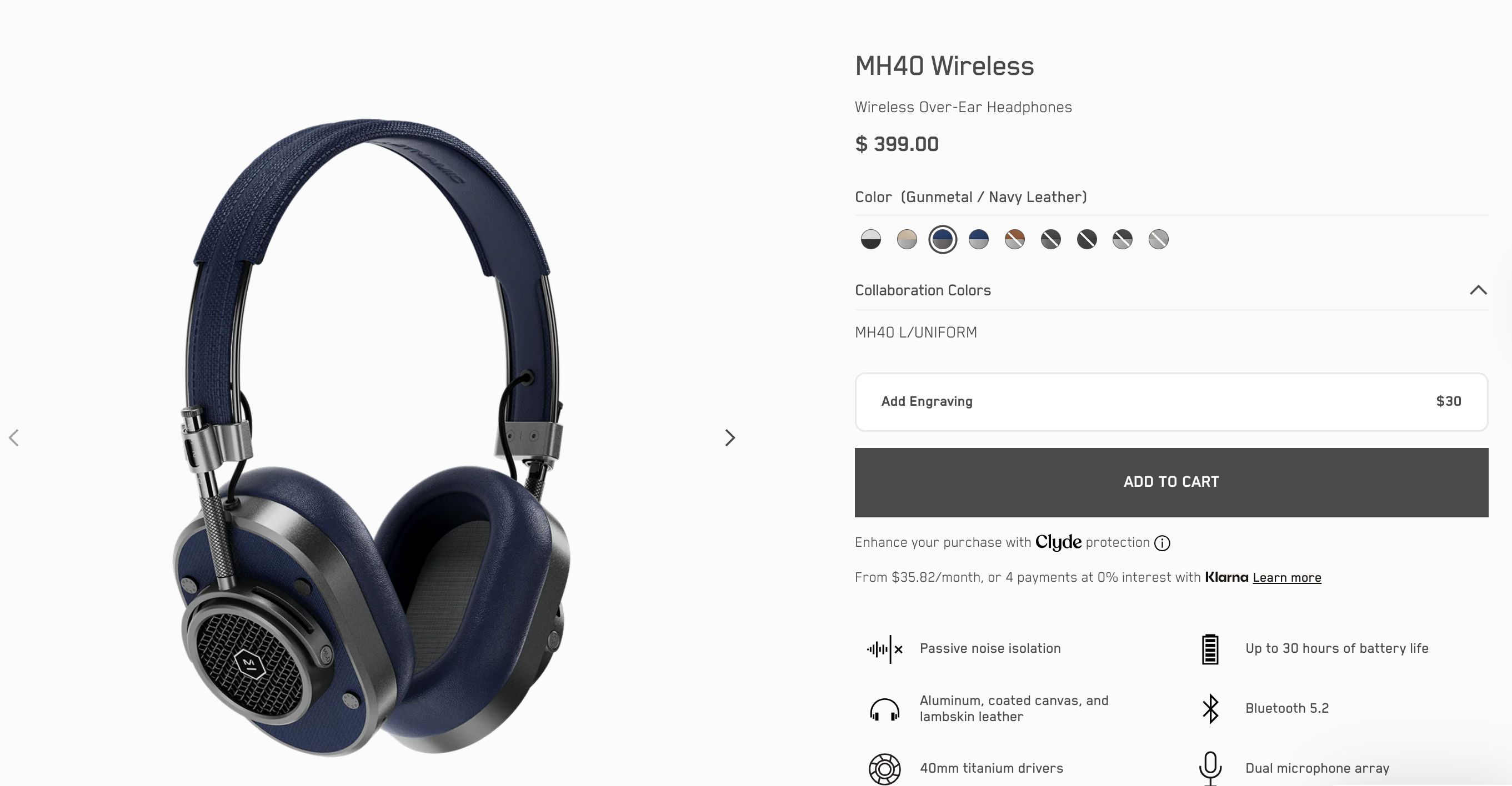
By showing both detail and real-world use, the brand helps shoppers visualize the product before it arrives, which is especially important for high-ticket items and first-time buyers.
3. Drive faster buying decisions with pricing & urgency triggers
Price presentation and subtle urgency cues can influence how quickly a shopper moves from consideration to purchase. When savings are made visible and time or stock signals are used with care, buyers are more likely to act without delay, especially on first-time or impulse-driven purchases.
-
Display savings clearly with compare-at pricing: Use Shopify’s built-in compare-at price field to show discounts visually (e.g., “Was £75, now £60”). Highlight the percentage or amount saved to the anchor value. Apps like Vitals or Sale Kit can add animated price tags or savings badges.
-
Use stock-based urgency cues: Show messages like “Only 3 left in stock” to communicate scarcity without aggressive language. This works best when connected to real-time inventory, especially for limited runs or trending products.
You can enable this using STOCKIE, Vitals, or Fera — these apps automatically display low-stock alerts based on live inventory. -
Add time-based urgency where appropriate: Use countdown timers to promote limited-time offers, early access, or seasonal deals. Ensure the offer is credible and consistent across pages to avoid trust issues. Tools like Urgency Bear or Countdown Timer Bar can automate this.
-
Reinforce urgency near the CTA: Place urgency messaging directly above or below the “Add to Cart” button to influence decision-making at the point of action. Avoid pushing it too far down the page, where it loses impact.
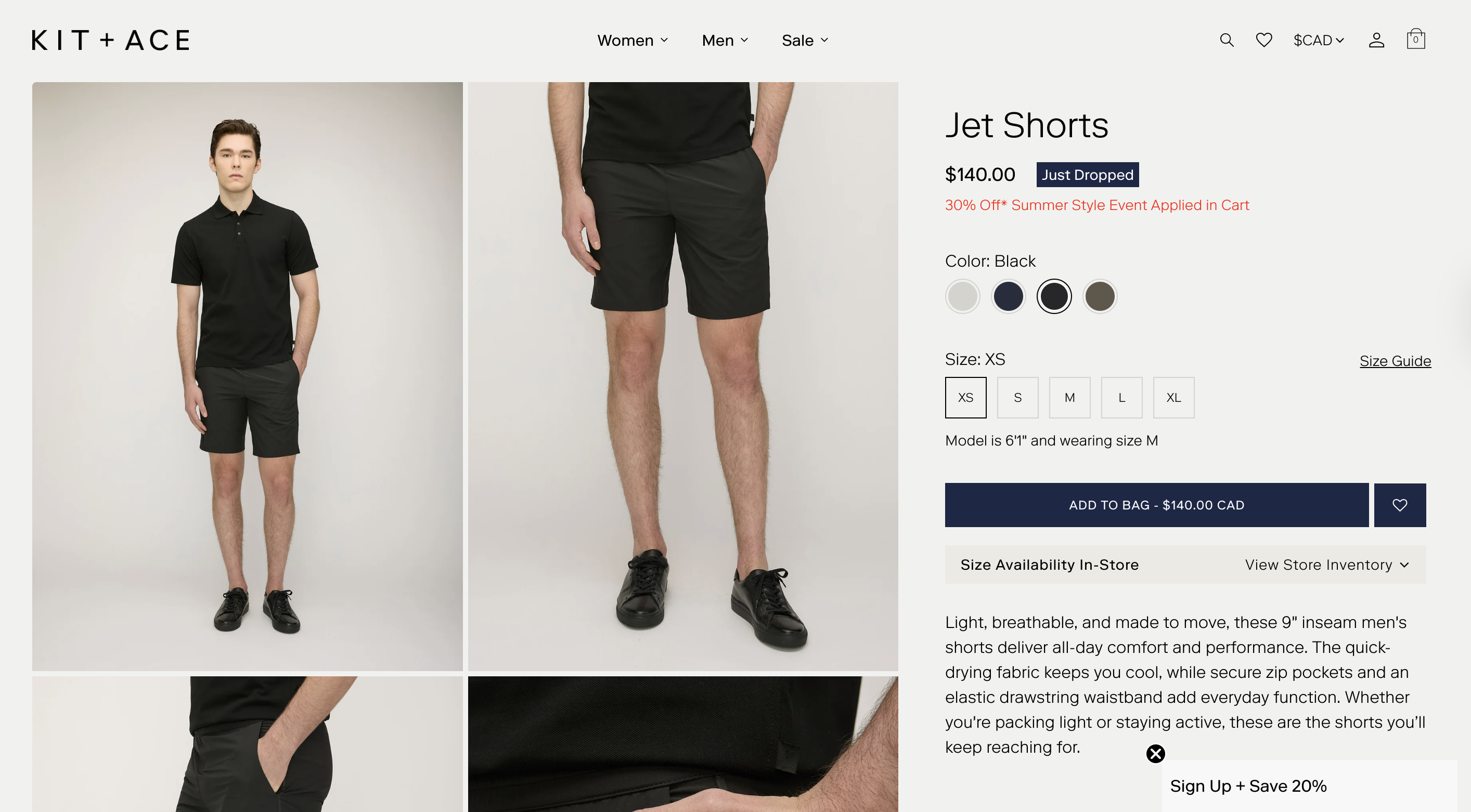
Case study: Kit and Ace
Kit and Ace, a modern clothing brand, uses subtle urgency and incentive messaging on their product pages to encourage conversion. Discount messaging appears directly beneath the price (e.g., “30% Off Summer Style Event Applied in Cart”), and new product drops are labelled with visual cues like “Just Dropped.” These time-sensitive prompts appear above the fold and near the “Add to Bag” CTA, helping to drive faster purchase decisions — especially during limited-time promotions or product launches.
4. Make your CTAs thumb‑friendly and action‑ready
A well-placed, clearly worded call-to-action ensures that when buyers are ready, the next step is obvious. This small detail can have a big impact on conversion—especially for high-intent traffic.
-
Place the CTA directly after key decision inputs: The CTA should appear immediately after core product information — title, price, and variant selectors. Avoid pushing it below long descriptions, reviews, or additional blocks. Buyers should encounter the CTA as soon as they’re ready to act.
You can use Shopify’s Theme Editor in Online Store 2.0 to reposition blocks easily. For mobile-first stores, consider sticky CTA tools like Sticky Add To Cart BOOSTER PRO to keep the button visible as users scroll. -
Use clear, purchase-specific language: Avoid default or passive terms like “Continue” or “Submit.” Use direct, familiar actions like “Add to Cart,” “Buy Now,” or “Pre-Order Today.” This reinforces user intent and reduces uncertainty.
You can customize CTA text in your theme code, or dynamically adjust labels using apps like Pre‑Order Now WOD for preorder logic and ReCharge for subscription CTAs. -
Keep CTA behaviour consistent across product types: If your store sells multiple types of offerings (e.g. subscriptions, bundles, backorders), ensure CTA labels and functionality remain consistent. For example, don’t mix “Subscribe” on one product and “Add to Cart” on another unless the purchase experience is fundamentally different. Inconsistency can make buyers hesitate or second-guess their next step.
You can use ReCharge for subscriptions and PickyStory for bundles to standardize behavior. -
Tailor CTA labels to reflect product context when helpful: Use dynamic CTA logic to improve relevance and build trust — for example, display “Pre-Order” when an item is out of stock. These adjustments help set expectations and reinforce what will happen next.
For multilingual or region-based CTA labels, apps like Transcy or Langify allow you to localize button text by market. Combine with Shopify’s conditional logic or dynamic sources for advanced control.
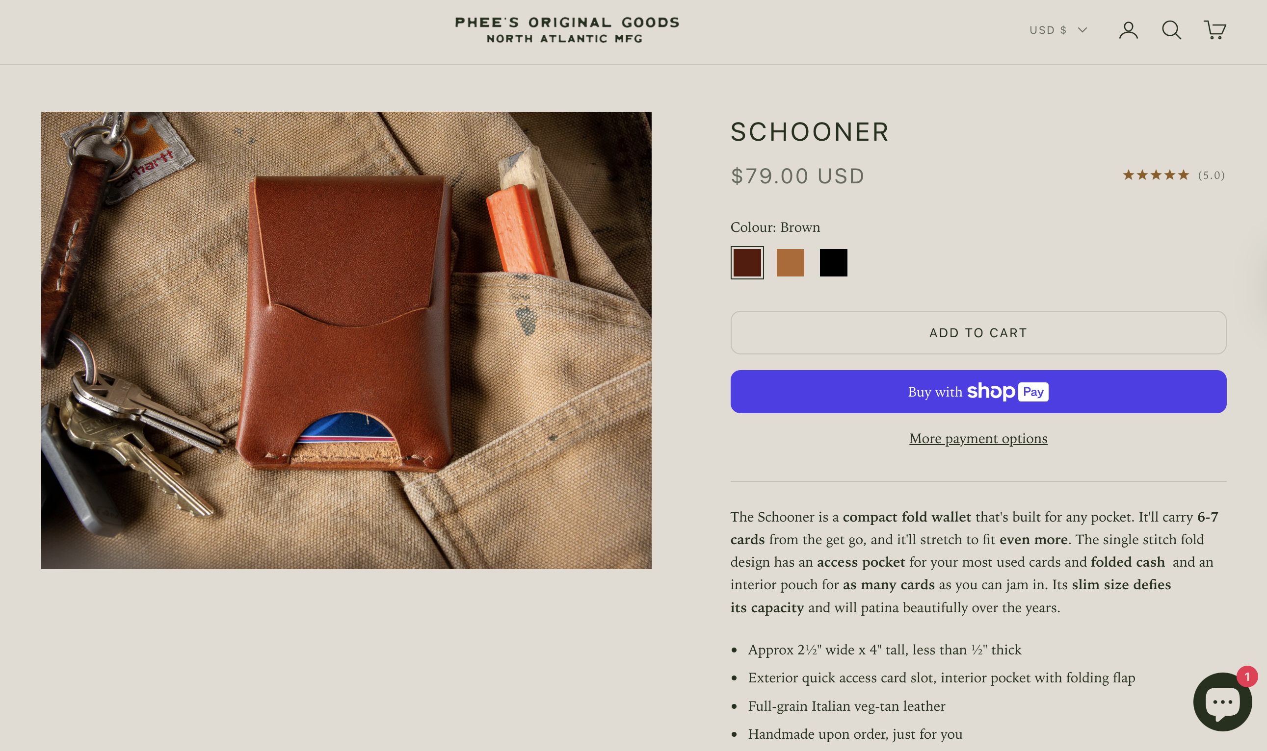
Case study: Phee’s Original Goods
Phee’s Original Goods makes its product pages highly actionable by ensuring the “Add to Cart” button is visible above the fold, especially on mobile. The button is large, tap-friendly, and immediately followed by a bold Shop Pay option for fast checkout. This ensures buyers encounter a clear, immediate next step.
5. Add trust-building elements to increase buyer confidence
Social proof, guarantees, and transparency reduce the perceived risk of buying, especially for first-time visitors unfamiliar with your brand.
-
Display customer reviews and star ratings: Visible, relevant reviews directly under the product description help validate the purchase. Use apps like Loox, Judge.me or Yotpo to display written reviews, star ratings, and even photos or videos from customers.
-
Surface visual cues of trust: Place well-recognized trust badges (e.g., secure checkout, money-back guarantee, SSL encryption) near your CTA to reassure shoppers at the point of decision. You can use image assets, icon blocks, or apps like Free Trust Badge Master to automate badge placement.
-
Include a product-specific FAQ or Q&A block: Many buyers hesitate due to unanswered questions about fit, care, warranty, compatibility, or returns. A short, collapsible FAQ section can answer these directly on the product page.
For dynamic setups, use apps like Product Questions and Answers by EnormApps to collect and display real customer questions and answers per product. -
Add social proof strategically: If your product is featured in the press, used by well-known customers, or has earned industry certifications, include this near the product description or CTA. For B2B products, this may include logos, testimonials, or awards that signal reliability and peer validation.
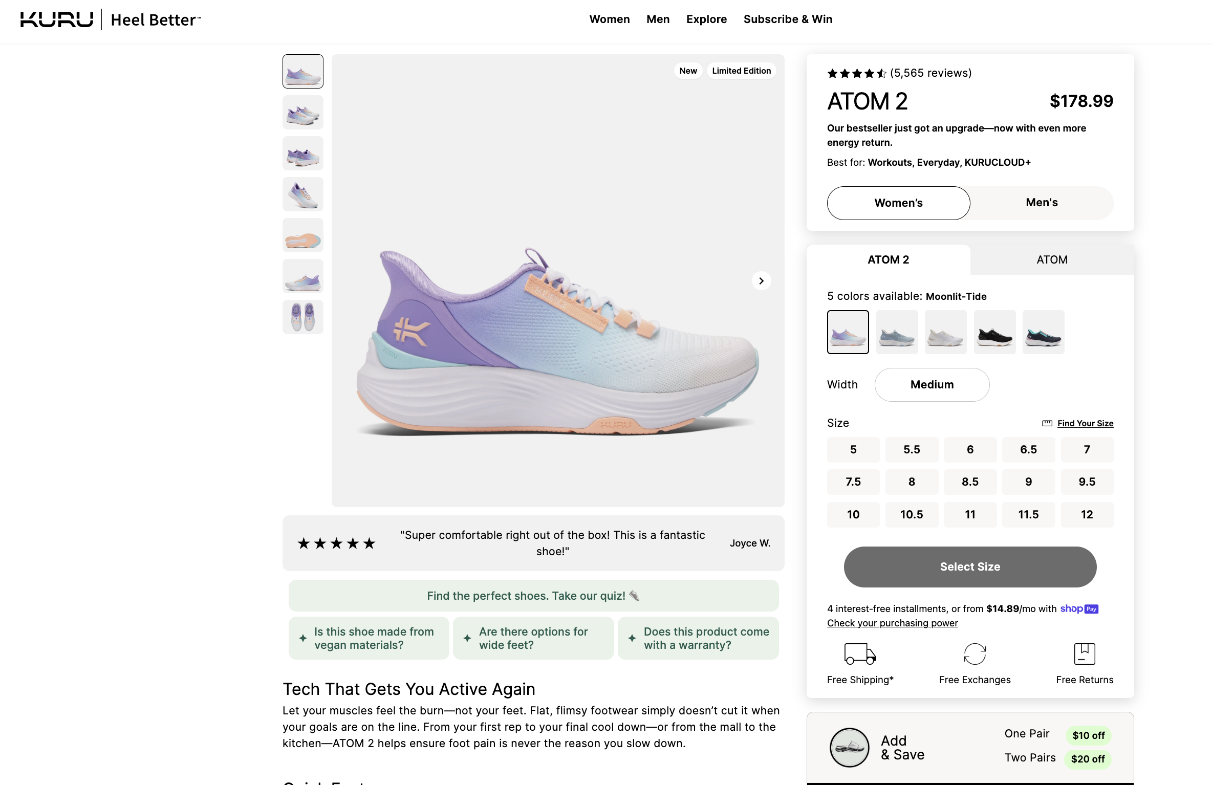
Case study: KURU Footwear
KURU uses trust-building elements to great effect on its product pages. Each listing includes:
-
Each listing features thousands of verified customer reviews (e.g., 5,500+ for the ATOM 2), prominently displayed near the top for immediate social proof.
-
Highlighted customer quote: A featured 5-star review is surfaced directly below the product image, reinforcing credibility with authentic sentiment.
-
Trust badge trio — “Free Shipping,” “Free Exchanges,” and “Free Returns” — is displayed directly below the “Select Size” CTA.
-
A Q&A-style trust block appears just below the review, answering concerns like:
-
Is this shoe made from vegan materials?
-
Are there options for wide feet?
-
Does this product come with a warranty?
These elements work together to create a low-risk, high-confidence environment that supports conversion, particularly for first-time or health-conscious buyers.
6. Reassure buyers with transparent shipping and returns
Delivery expectations and return policies are deal-breakers for many shoppers. Making them visible before checkout increases trust and reduces friction.
-
Show delivery timelines and shipping costs upfront: Where possible, display estimated delivery dates based on customer location or product availability. This helps manage expectations and gives shoppers a reason to buy now — especially for time-sensitive purchases. Avoid hiding shipping costs until checkout.
To automate this, use Shopify Metafields or apps like Estimated Delivery Date Range to dynamically surface timelines by region, warehouse, or product type. -
Highlight return and exchange policies clearly: Don’t bury key post-purchase information in the footer. Reassure customers by placing simplified return language (“30-day returns,” “Free exchanges”) near the product description or CTA. For higher-priced items or bulk orders, offer more detailed explanations in a collapsible section or FAQ.
To enhance clarity and branding, consider using apps like Return Prime or AfterShip Returns, which help display return policies in a more structured, user-friendly format. -
Localize policies when applicable: If your shipping or return terms vary by region or product type, use Shopify Metafields with conditional Liquid logic or dynamic content apps like Estimated Delivery Date Range or Return Prime to display the right information per customer. This is especially important for cross-border orders or specialized B2B agreements.
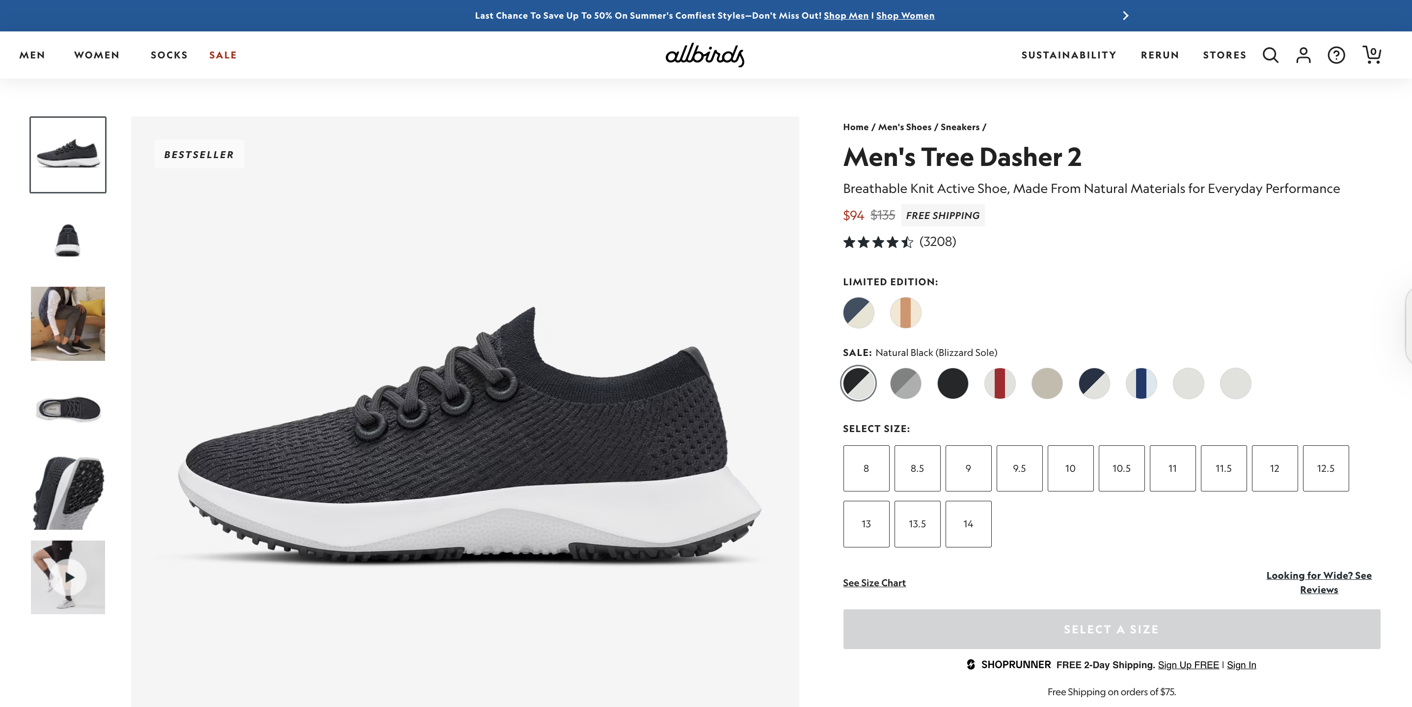
Case study: Allbirds
Allbirds exemplifies how transparent shipping and return policies can reduce friction and build trust — especially for new customers browsing high-consideration products like footwear:
-
A “Free Shipping” label appears directly next to the discounted price, reinforcing value early in the buying journey.
-
Free 2-day shipping (via ShopRunner) and a “Free Shipping on orders over $75” note are displayed clearly under the CTA area, removing surprises at checkout.
-
The returns policy is both simplified and visible: the product page notes “Easy Returns within 30 days”, and a detailed Shipping & Returns section below explains exclusions and timelines.
This transparency reduces buyer friction and is part of why Allbirds boasts such high conversion rates and customer satisfaction, especially among new and sustainability-conscious shoppers.
7. Reduce friction with pre-checkout shortcuts
Even small barriers in the purchase flow can derail a conversion. Direct paths to checkout and visible reassurance signals help buyers commit with confidence.
-
Add a direct-to-checkout “Buy Now” button: For products likely to be purchased individually (e.g., impulse buys, repeat orders), include a CTA like “Buy Now” that skips the cart and takes users straight to checkout. This removes friction for high-intent buyers.
This can be done using Shopify’s payment_button object or with apps like Buy Me – Sticky Buy Button, which also supports sticky placement and mobile-optimized one-click checkout. -
Display express payment badges near the CTA: Showing Apple Pay, Google Pay, or Shop Pay icons under the Add to Cart button reassures customers that fast, secure checkout options are available. This increases trust and reduces uncertainty before buyers even click.
You can add them manually via a custom block or use an app like Free Trust Badge Master to insert branded badges without editing theme code. -
Minimise distractions around the purchase area: Keep the area around your CTAs focused. Avoid placing banners, unrelated product blocks, or secondary forms (e.g., email signup) near the point of action. Give the buyer a single, clear path forward.
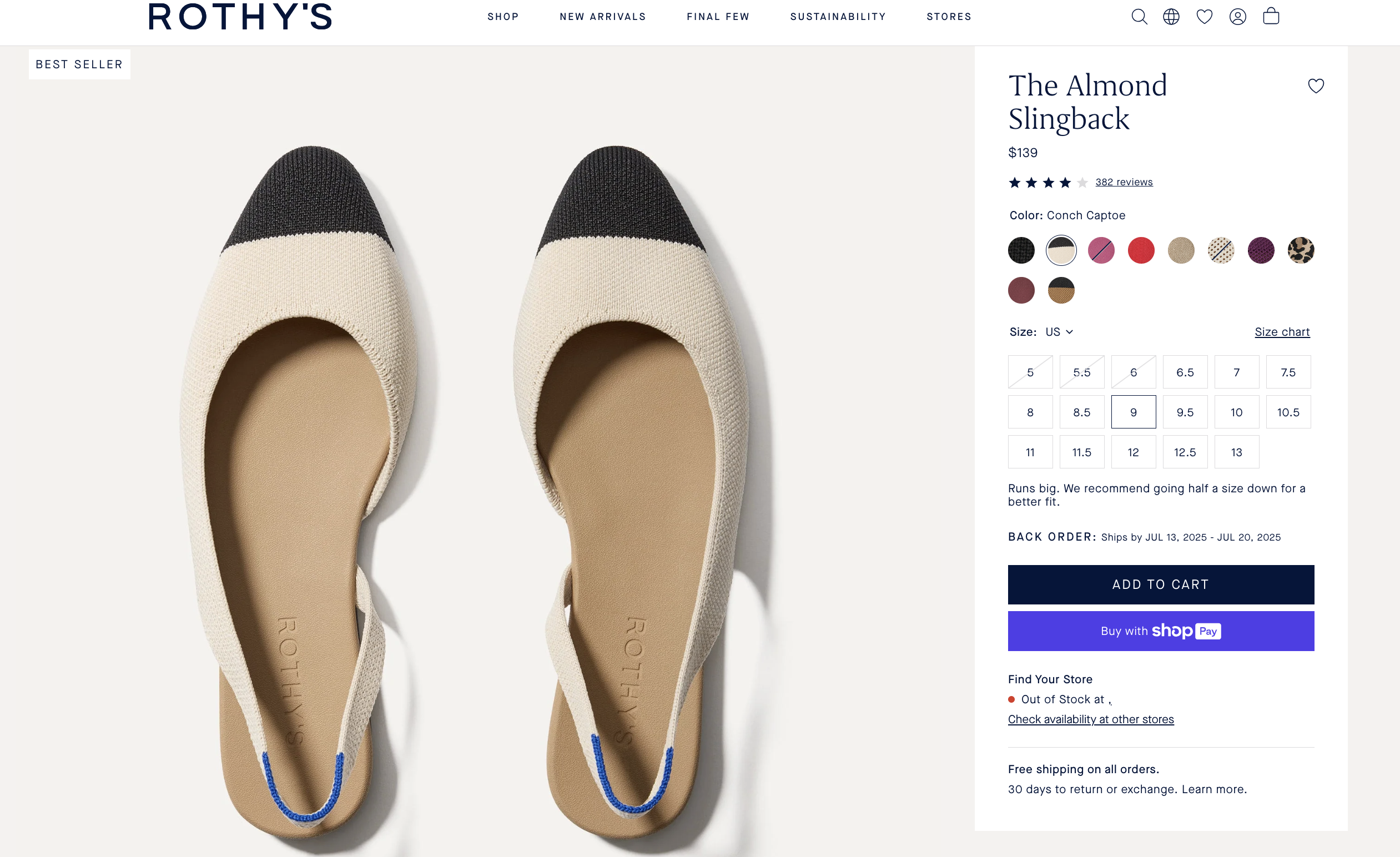
Case study: Rothy’s
Rothy’s streamlines its product page to reduce pre-checkout friction:
-
One-click checkout: A prominent “Buy with Shop Pay” button lets high-intent shoppers skip the cart and check out instantly.
-
Trusted payment badge: The Shop Pay logo reinforces security and speed directly below the CTA.
-
Clean, focused purchase area: The product page avoids clutter around the CTA. No pop-ups or secondary distractions interrupt the flow, allowing buyers to act without hesitation.
This setup makes it easy for shoppers to convert quickly — especially those looking for convenience and speed without compromise.
8. Use upselling and cross-selling to maximize each order
Once a shopper has committed to buying, it’s your best opportunity to increase order value, without increasing acquisition cost. This tactic focuses on subtle, high-relevance ways to help customers buy more.
-
Show complementary product suggestions: Use sections like “Complete the Look,” “Pairs well with,” or “You Might Also Like” to recommend items that align with the customer’s current selection. Prioritise relevance—curated or rule-based bundles typically outperform generic recommendations.
These can be implemented using Shopify’s native recommendations or third-party cross-sell apps like PickyStory or Frequently Bought Together. -
Offer volume discounts or multipacks: Incentivise larger orders with tiered pricing (“Buy 2, save 10%”) or pre-configured bundles. This is especially effective for consumables, accessories, or repeat-purchase items.
You can use Shopify’s automatic discounts or bundling apps such as Bold Bundles or Bundle Bear for more complex configurations. -
Position upsell and cross-sell content thoughtfully: Place suggestions below the primary CTA or at the bottom of the product form—never between the shopper and their ability to buy. Distraction at the wrong stage in the decision flow can reduce conversions.
Dynamic upsells can be set up using tools like ReConvert, Cart Upsell & Cross Sell, or LimeSpot Personalizer. -
Use dynamic logic to personalize offers: For stores with diverse product lines or customer types, use conditional logic or Shopify apps to tailor upsell content by collection, tag, or cart contents. This avoids irrelevant promotions that could erode trust.
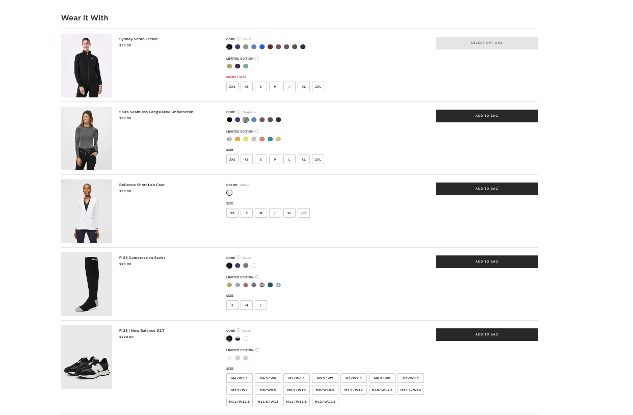
Case study: FIGS
FIGS, boosts average order value by using purposeful, well-placed cross-sells on its product pages:
-
A dedicated “Wear It With” section showcases complementary items — like jackets, socks, and shoes — that pair naturally with the shopper’s selected scrub set.
-
The cross-sell block appears after the main product selection and CTA, keeping the purchase flow focused while encouraging thoughtful add-ons.
-
Each recommendation aligns with the customer’s context (e.g., work uniforms), increasing relevance and boosting conversion likelihood.
9. Ensure a seamless buying experience on mobile
Optimizing product pages for mobile ensures buyers can explore, evaluate, and act without unnecessary effort. A smooth mobile flow supports conversions across all customer types.
-
Use a responsive, mobile-optimized theme: Start with a theme built for mobile-first browsing. Shopify’s Online Store 2.0 themes — like Dawn, Sense, or the newly released Horizon (introduced in Summer Edition 2025) — include touch-friendly layouts, larger tap targets, swipeable image galleries, and vertically stacked sections. Horizon introduces refined spacing, improved image handling and updated typography for smaller screens. Avoid themes that hide key content behind tabs or require excessive scrolling.
-
Keep critical content above the fold: On smaller screens, large hero images or carousels often push vital product information below the fold. Ensure the product name, price, and “Add to Cart” button appear early — either in the initial viewport or via a sticky header.
-
Enable sticky CTAs for continuous access: A fixed “Add to Cart” or “Buy Now” button ensures the shopper never has to scroll back up to take action. Most mobile-first Shopify themes support this natively, or you can use apps like Sticky Add To Cart BOOSTER PRO or Vitals.
-
Space out variant selectors and dropdowns: Ensure size, color, or customization options are easy to tap, especially for complex products. Spacing should prevent accidental selections or scroll errors. Test touch targets using real devices to validate layout quality.
-
Optimize media for mobile interaction: Use swipeable image galleries and test zoom functionality on mobile. Don’t rely on hover states or desktop-only interactions. Tools like Magic Zoom Plus or native theme settings can enhance media engagement without slowing performance.
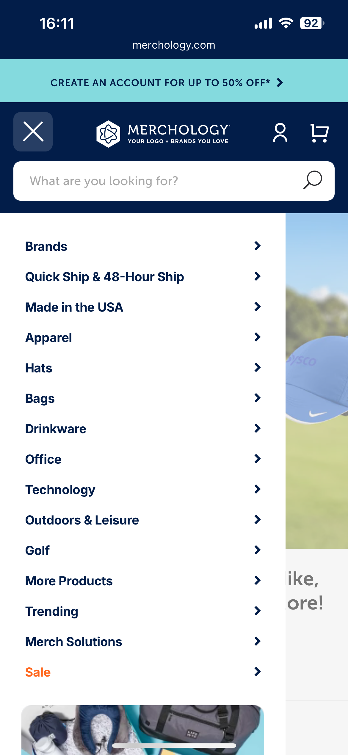
Case study: Merchology (B2B mobile overhaul)
Merchology, a Shopify-backed B2B custom apparel store, redesigned its mobile UX by simplifying navigation, implementing sticky CTAs, and optimizing page speed. Within one month of going mobile-first, they achieved:
-
A 40% boost in mobile conversion rate
-
A 340% increase in revenue per mobile device
This demonstrates how mobile-specific improvements—without redesigning the entire desktop site—can deliver significant and rapid gains.
For a deeper dive into real-world results and implementation tips, explore the full breakdown in our article on Shopify mobile optimization.
10. Customize page layout with Shopify’s tools to better guide purchase decisions
Tailoring your product page layout to match buyer intent helps you highlight what matters most — whether that’s storytelling, technical details, or trust signals. Shopify’s design tools give you the flexibility to test, segment, and optimize layouts without custom code.
-
Use custom sections and blocks in Online Store 2.0 themes: Take full control of your product page structure with Shopify’s drag-and-drop section editor. Add, remove, or reposition elements like reviews, FAQs, feature lists, or trust badges to match your product’s conversion flow — all without editing code.
-
Personalize layout by product type or audience: Tailor what’s shown based on the nature of the product. For example:
-
Show styling tips first for fashion
-
Prioritize technical specs for electronics
-
Highlight certifications or ingredients for wellness products
-
Add strategic content blocks to reinforce brand trust and values: Use sections like Image-with-Text or Icon List to highlight “Why Buy From Us” points — such as ethical sourcing, local production, or customer support guarantees. These blocks work best when placed near CTAs or areas of hesitation to reduce friction and reinforce buyer confidence.
-
Establish a clear visual hierarchy: Use Shopify’s theme settings to style key content blocks with color backgrounds, spacing, and typography. For per-product styling, combine with Metafields to dynamically apply visual emphasis (e.g., callouts for guarantees or value props).
-
Upgrade to premium OS 2.0 themes for advanced layout options: Themes like Prestige, Impulse, or Motion offer built-in alternate templates, tabbed content blocks, and enhanced layout control.
-
Use page builder apps for complete layout freedom: Tools like PageFly or Shogun let you design fully custom product pages — including branded storytelling sections, custom CTAs, mobile-only content, or campaign-specific layouts.
11. Optimize product page performance and technical SEO
Fast-loading, well-structured product pages support both discoverability and conversion. Investing here strengthens every other tactic in the Optimization stack.
-
Improve page speed to reduce bounce and increase engagement: Remove unused apps or scripts, reduce image weight with pre-optimized WebP files, and use lazy loading to prevent blocking.
Shopify auto-compresses media on upload, but the compression is basic and can lower image quality — so it’s still best to upload fully optimized files using tools like TinyIMG, AVADA SEO & Image Optimizer, or Booster: Page Speed Optimizer. -
Use structured data (schema markup): Ensure your product pages include structured data for title, price, availability, rating, and reviews. This helps your listings appear with rich results in Google (e.g., star ratings, pricing), improving CTR and product discovery.
Most themes include a basic schema. For advanced coverage, use apps like Smart SEO, JSON-LD for SEO by Ilana Davis, or SEO Manager. -
Optimize meta titles and descriptions: Write SEO-focused meta titles (under 60 characters) and meta descriptions (under 155 characters) that reflect what the product solves or delivers. Avoid duplicates and include key terms aligned with customer search intent.
You can automate SEO metadata generation and monitoring with Plug In SEO or Smart SEO. -
Submit product pages to your sitemap and monitor indexing: Shopify automatically generates your sitemap at
/sitemap.xml, but you should verify indexing in Google Search Console. Address crawl issues or coverage errors early, especially for seasonal or high-margin products.
What to watch out for when optimizing Shopify product pages
Optimizing a product page isn’t just about what you add — it’s also about what you avoid. Poor decisions in layout, testing, or tooling can introduce new friction or undermine earlier improvements. This section outlines common missteps that can quietly reduce conversion performance as your store scales.
-
Cluttered or inconsistent layouts: Overloading the product page with competing blocks—like pop-ups, carousels, or stacked features—can overwhelm shoppers and dilute the primary call to action. Focus on visual hierarchy: ensure that product content, media, and CTA remain the focal points, especially on mobile.
- Too many disconnected third-party apps: Relying on multiple single-purpose apps can slow your site and introduce UI or compatibility issues. Instead of mixing apps from different developers, choose solutions from the same provider (e.g., Vitals, Growave, Judge.me) to ensure smoother integration, consistent styling, and lower script load.
-
Testing multiple changes at once: One of the most common testing mistakes is rolling out several changes—such as layout, copy, imagery, or trust elements—at the same time. While this might feel efficient, it makes it impossible to attribute results to any one change. Without clear attribution, you risk doubling down on elements that didn’t move the needle. To generate meaningful insights, test one variable at a time using tools like Shopify A/B Testing (Plus), Convert or Theme Scientist and define what success looks like before launching.
- Short-term fixes over platform-aligned solutions: Patching limitations with extra apps or manual workarounds can become unsustainable as traffic grows. If you frequently encounter constraints, consider whether a theme rebuild or Shopify Plus might offer native solutions through Scripts, Functions or custom templates.
How to measure Shopify product page optimization success
To validate that your efforts are driving real results, you need to track both direct conversion metrics and behavioral signals across the funnel. This section outlines which metrics to prioritize, how to interpret them, and what tools to use.
Key metrics to track and signs of low-converting product pages
These product page signals help identify where and why visitors may be dropping off. They’re especially useful when diagnosing issues within the product engagement stage of the funnel.
-
High bounce rate (e.g., > 60%): Often signals a disconnect between traffic source and product relevance, slow load times, or weak above-the-fold content.
-
Short session duration: Indicates that shoppers aren’t engaging — commonly caused by thin product content, unclear CTAs, or lack of compelling visuals.
-
Low add-to-cart rate (e.g., < 4%): Suggests that the product page isn’t persuasive enough — whether due to poor copy, weak trust signals, or low clarity around pricing, value, or variants.
-
Low review interaction (scrolling, clicks, expand rate): Implies that shoppers don’t trust or see value in the social proof displayed — possibly due to poor placement, limited quantity, or unconvincing formatting.
-
High cart abandonment (when sourced from product pages): This may reflect missing trust signals, unaddressed shipping costs, or an abrupt shift in UX once the user leaves the product page.
How to track performance
-
Shopify Analytics: Use built-in reports to track product-specific sales, add-to-cart rates, and page views. Segment by device to identify mobile-specific drop-off.
-
Google Analytics 4 (GA4): Set up enhanced eCommerce tracking to monitor the full journey: product view → add to cart → checkout → purchase.
-
Google Search Console: Monitor impressions, click-through rate, and indexing health for each product page. Use this to evaluate SEO-focused optimizations.
-
A/B testing tools: Run controlled experiments using Shopify A/B Testing (Plus), Convert, or Theme Scientist to test layout changes, copy variations, or media swaps.
-
Heatmaps and session recordings: Use tools like Hotjar, Lucky Orange, or Microsoft Clarity to visualize how customers interact with your product pages. This helps identify scroll drop-offs, ignored sections, or high-interest zones.
Tip: Connect GSC + GA4 + Shopify Analytics + Search & Discovery to centralize insight across acquisition, behavior and conversion.
Conclusion
Product page performance isn't improved by surface-level changes — it requires a deliberate focus on how shoppers evaluate, engage, and act.
In this article, we’ve explored how to turn your Shopify product pages into high-performing assets. Key takeaways include:
-
Start with the essentials: Content, visuals, CTAs, pricing, and trust signals are the core elements that drive decisions.
-
Proven Shopify product optimization tactics: From pricing and visuals to CTAs and trust signals, every Optimization aligns with how shoppers navigate and decide on your product page.
-
Avoid unnecessary complexity: Too many scripts, inconsistent layouts, or unclear tests can quietly undermine performance.
-
Track what matters: Use data to validate what’s working and guide your next iteration.
At On Tap - A trusted Shopify development agency, we bring together strategic insight, technical implementation, and CRO best practices to help Shopify merchants turn product pages into reliable revenue drivers. If you're looking to turn more traffic into sales and scale with confidence, we can help.
Talk to our team to explore how we can support your optimization goals.